Hello !
```
Page
}
```
### Start the Panda build process
Run the CLI tool to scan your JavaScript and TypeScript files for style properties and call expressions.
*': { margin: '2' }
})}
/>
)
}
```
This also works with the supported at-rules (`@media`, `@layer`, `@container`, `@supports`, and `@page`):
```tsx
import { css } from '../styled-system/css'
const App = () => {
return (
)
}
```
## Pseudo Classes
### Hover, Active, Focus, and Disabled
You can style the hover, active, focus, and disabled states of an element using their `_` modifier:
```jsx
```
### First, Last, Odd, Even
You can style the first, last, odd, and even elements of a group using their `_` modifier:
```jsx
{items.map(item => (
```
## Pseudo Elements
### Before and After
You can style the `::before` and `::after` pseudo elements of an element using their `_before` and `_after` modifier:
```jsx
```
This modifer for every pseudo class modifiers like `_groupHover`, `_groupActive`, `_groupFocus`, and `_groupDisabled`,
etc.
## Sibling Selectors
When you need to style an element based on its sibling element's state or attribute, you can add the `peer` class to the
sibling element, and use any of the `_peer*` modifiers on the target element.
```jsx
```
> Note: This only works for when the element marked with `peer` is a previous siblings, that is, it comes before the
> element you want to start.
## Data Attribute
### LTR and RTL
You can style an element based on the direction of the text using the `_ltr` and `_rtl` modifiers:
```jsx
```
For this to work, you need to set the `dir` attribute on the parent element. In most cases,you can set this on the
`html` element.
> **Note:** Consider using logical css properties like `marginInlineStart` and `marginInlineEnd` instead their physical
> counterparts like `marginLeft` and `marginRight`. This will reduce the need to use the `_ltr` and `_rtl` modifiers.
### State
You can style an element based on its `data-{state}` attribute using the corresponding `_{state}` modifier:
```jsx
/` syntax:
> The default container syntax is `@/`.
```ts
import { css } from '/styled-system/css'
function Demo() {
return (
)
}
```
This will generate the following CSS:
```css
.cq-type_inline-size {
container-type: inline-size;
}
@container (min-width: 60em) {
.\@\/sm:fs_md {
container-type: inline-size;
}
}
```
You can also named container queries:
```ts
import { cq } from 'styled-system/patterns'
function Demo() {
return (
)
}
```
## Reference
Here's a list of all the condition shortcuts you can use in Panda:
| Condition name | Selector |
| ---------------------- | -------------------------------------------------------------------------------------------------|
| \_hover | `&:is(:hover, [data-hover])` |
| \_focus | `&:is(:focus, [data-focus])` |
| \_focusWithin | `&:focus-within` |
| \_focusVisible | `&:is(:focus-visible, [data-focus-visible])` |
| \_disabled | `&:is(:disabled, [disabled], [data-disabled], [aria-disabled=true])` |
| \_active | `&:is(:active, [data-active])` |
| \_visited | `&:visited` |
| \_target | `&:target` |
| \_readOnly | `&:is(:read-only, [data-read-only], [aria-readonly=true])` |
| \_readWrite | `&:read-write` |
| \_empty | `&:is(:empty, [data-empty])` |
| \_checked | `&:is(:checked, [data-checked], [aria-checked=true], [data-state="checked"])` |
| \_enabled | `&:enabled` |
| \_expanded | `&:is([aria-expanded=true], [data-expanded], [data-state="expanded"])` |
| \_highlighted | `&[data-highlighted]` |
| \_complete | `&[data-complete]` |
| \_incomplete | `&[data-incomplete]` |
| \_dragging | `&[data-dragging]` |
| \_before | `&::before` |
| \_after | `&::after` |
| \_firstLetter | `&::first-letter` |
| \_firstLine | `&::first-line` |
| \_marker | `&::marker, &::-webkit-details-marker` |
| \_selection | `&::selection` |
| \_file | `&::file-selector-button` |
| \_backdrop | `&::backdrop` |
| \_first | `&:first-child` |
| \_last | `&:last-child` |
| \_only | `&:only-child` |
| \_even | `&:nth-child(even)` |
| \_odd | `&:nth-child(odd)` |
| \_firstOfType | `&:first-of-type` |
| \_lastOfType | `&:last-of-type` |
| \_onlyOfType | `&:only-of-type` |
| \_peerFocus | `.peer:is(:focus, [data-focus]) ~ &` |
| \_peerHover | `.peer:is(:hover, [data-hover]) ~ &` |
| \_peerActive | `.peer:is(:active, [data-active]) ~ &` |
| \_peerFocusWithin | `.peer:focus-within ~ &` |
| \_peerFocusVisible | `.peer:is(:focus-visible, [data-focus-visible]) ~ &` |
| \_peerDisabled | `.peer:is(:disabled, [disabled], [data-disabled], [aria-disabled=true]) ~ &` |
| \_peerChecked | `.peer:is(:checked, [data-checked], [aria-checked=true], [data-state="checked"]) ~ &` |
| \_peerInvalid | `.peer:is(:invalid, [data-invalid], [aria-invalid=true]) ~ &` |
| \_peerExpanded | `.peer:is([aria-expanded=true], [data-expanded], [data-state="expanded"]) ~ &` |
| \_peerPlaceholderShown | `.peer:placeholder-shown ~ &` |
| \_groupFocus | `.group:is(:focus, [data-focus]) &` |
| \_groupHover | `.group:is(:hover, [data-hover]) &` |
| \_groupActive | `.group:is(:active, [data-active]) &` |
| \_groupFocusWithin | `.group:focus-within &` |
| \_groupFocusVisible | `.group:is(:focus-visible, [data-focus-visible]) &` |
| \_groupDisabled | `.group:is(:disabled, [disabled], [data-disabled], [aria-disabled=true]) &` |
| \_groupChecked | `.group:is(:checked, [data-checked], [aria-checked=true], [data-state="checked"]) &` |
| \_groupExpanded | `.group:is([aria-expanded=true], [data-expanded], [data-state="expanded"]) &` |
| \_groupInvalid | `.group:is(:invalid, [data-invalid], [aria-invalid=true]) &` |
| \_indeterminate | `&:is(:indeterminate, [data-indeterminate], [aria-checked=mixed], [data-state="indeterminate"])` |
| \_required | `&:is(:required, [data-required], [aria-required=true])` |
| \_valid | `&:is(:valid, [data-valid])` |
| \_invalid | `&:is(:invalid, [data-invalid], [aria-invalid=true])` |
| \_userValid | `&:is(:user-valid, [data-user-valid])` |
| \_userInvalid | `&:is(:user-invalid, [data-user-invalid])` |
| \_autofill | `&:autofill` |
| \_inRange | `&:is(:in-range, [data-in-range])` |
| \_outOfRange | `&:is(:out-of-range, [data-outside-range])` |
| \_placeholder | `&::placeholder, &[data-placeholder]` |
| \_placeholderShown | `&:is(:placeholder-shown, [data-placeholder-shown])` |
| \_pressed | `&:is([aria-pressed=true], [data-pressed])` |
| \_selected | `&:is([aria-selected=true], [data-selected])` |
| \_grabbed | `&:is([aria-grabbed=true], [data-grabbed])` |
| \_underValue | `&[data-state=under-value]` |
| \_overValue | `&[data-state=over-value]` |
| \_atValue | `&[data-state=at-value]` |
| \_default | `&:default` |
| \_optional | `&:optional` |
| \_open | `&:is([open], [data-open], [data-state="open"], :popover-open)` |
| \_closed | `&:is([closed], [data-closed], [data-state="closed"])` |
| \_fullscreen | `&:is(:fullscreen, [data-fullscreen])` |
| \_loading | `&:is([data-loading], [aria-busy=true])` |
| \_hidden | `&:is([hidden], [data-hidden])` |
| \_inert | `&:is([inert], [data-inert])` |
| \_current | `&:is([aria-current=true], [data-current])` |
| \_currentPage | `&[aria-current=page]` |
| \_currentStep | `&[aria-current=step]` |
| \_today | `&[data-today]` |
| \_unavailable | `&[data-unavailable]` |
| \_rangeStart | `&[data-range-start]` |
| \_rangeEnd | `&[data-range-end]` |
| \_now | `&[data-now]` |
| \_topmost | `&[data-topmost]` |
| \_motionReduce | `@media (prefers-reduced-motion: reduce)` |
| \_motionSafe | `@media (prefers-reduced-motion: no-preference)` |
| \_print | `@media print` |
| \_landscape | `@media (orientation: landscape)` |
| \_portrait | `@media (orientation: portrait)` |
| \_dark | `.dark &` |
| \_light | `.light &` |
| \_osDark | `@media (prefers-color-scheme: dark)` |
| \_osLight | `@media (prefers-color-scheme: light)` |
| \_highContrast | `@media (forced-colors: active)` |
| \_lessContrast | `@media (prefers-contrast: less)` |
| \_moreContrast | `@media (prefers-contrast: more)` |
| \_ltr | `:where([dir=ltr], :dir(ltr)) &` |
| \_rtl | `:where([dir=rtl], :dir(rtl)) &` |
| \_scrollbar | `&::-webkit-scrollbar` |
| \_scrollbarThumb | `&::-webkit-scrollbar-thumb` |
| \_scrollbarTrack | `&::-webkit-scrollbar-track` |
| \_horizontal | `&[data-orientation=horizontal]` |
| \_vertical | `&[data-orientation=vertical]` |
| \_icon | `& :where(svg)` |
| \_starting | `@starting-style` |
| \_noscript | `@media (scripting: none)` |
| \_invertedColors | `@media (inverted-colors: inverted)` |
| \_pointerFine | `@media (pointer: fine)` |
| \_pointerCoarse | `@media (pointer: coarse)` |
| \_pointerNone | `@media (pointer: none)` |
| \_anyPointerFine | `@media (any-pointer: fine)` |
| \_anyPointerCoarse | `@media (any-pointer: coarse)` |
| \_anyPointerNone | `@media (any-pointer: none)` |
## Custom conditions
Panda lets you create your own conditions, so you're not limited to the ones in the default preset. Learn more about
customizing conditions [here](/docs/design-systems/conditions).
---
## Dynamic styling
How to manage dynamic styling in Panda
While Panda is mainly focused on the statically analyzable styles, you might need to handle dynamic styles in your
project.
> We recommend that you **avoid relying on runtime values for your styles** . Consider using recipes, css variables or
> `data-*` attributes instead.
Here are some ways you can handle dynamic styles in Panda:
## Runtime values
Using a value that is not statically analyzable at build-time will not work in Panda due to the inability to determine
the style values.
```tsx filename="App.tsx"
import { useState } from 'react'
import { css } from '../styled-system/css'
const App = () => {
const [color, setColor] = useState('red.300')
return (
)
}
```
The example above will not work because Panda can't determine the value of `color` at build-time. Here are some ways to
fix this:
### Using Static CSS
Panda supports a [`staticCss`](/docs/design-systems/static) option in the config you can use to pre-generate some styles ahead
of time.
```tsx filename="panda.config.ts"
import { defineConfig } from '@pandacss/dev'
export default defineConfig({
staticCss: {
css: [
{
properties: {
// ✅ Good: Pre-generate the styles for the color
color: ['red.300']
}
}
]
}
})
```
```tsx filename="Button.tsx"
import { useState } from 'react'
import { styled } from '../styled-system/jsx'
export const Button = () => {
const [color, setColor] = useState('red.300')
// ✅ Good: This will work because `red.300` is pre-generated using `staticCss` config
return
)
}
```
As long as all prop-value pairs are statically extractable, Panda will automatically generate the CSS, so avoid using
runtime values:
```tsx filename="App.tsx"
import { useState } from 'react'
const App = () => {
const [color, setColor] = useState('blue.300')
// ❌ Avoid: Panda can't determine the value of color at build-time
return (
)
}
```
## Property Renaming
Due to the static nature of Panda, you can't rename properties at runtime.
```tsx filename="App.tsx"
import { Circle, CircleProps } from '../styled-system/jsx'
type Props = {
circleSize?: CircleProps['size']
}
const CustomCircle = (props: Props) => {
const { circleSize = '3' } = props
return (
)
}
```
Since none of the conditions above are statically extractable, Panda will generate css for all possible code path,
resulting in a css that looks like this:
```css
/* ... */
@layer utilities {
.hover\:text_red\.100:where(:hover, [data-hover]) {
color: var(--colors-red-100);
}
.text_red\.200 {
color: var(--colors-red-200);
}
.hover\:text_red\.300:where(:hover, [data-hover]) {
color: var(--colors-red-300);
}
@media screen and (min-width: 768px) {
.hover\:md\:text_red\.400:where(:hover, [data-hover]) {
color: var(--colors-red-400);
}
}
.text_red\.500 {
color: var(--colors-red-500);
}
.text_red\.600 {
color: var(--colors-red-600);
}
}
/* ... */
```
## Referenced values
Although you should have your styles inlined most of the time, maybe you want to store a value in a variable and re-use
in multiple places. This should be fine as long as you keep it statically analyzable.
Here's a short list of things to avoid:
- Variables that are not defined in the same file
- Variables resulting from a function call (e.g. `const color = getColor()`)
> If you don't know what value a variable holds with a quick glance, Panda won't be able to either.
```tsx
import { css } from '../styled-system/css'
// ✅ Good: All values are statically extractable
const mainColor = 'red.300'
const sizes = { sm: '12px', md: '16px', '2xl': '42px' }
const App = () => {
return (
)
}
```
### Runtime reference on known objects
Using a more complex but still common example :
```tsx
import { useState } from 'react'
import { css } from '../styled-system/css'
const colorByType = {
primary: 'red.300',
secondary: 'blue.300',
tertiary: 'green.300'
}
const Section = () => {
const [type, setType] = useState('primary')
// ❌ Avoid: since only "gray.100" is statically extractable here
// This will not work as expected, the color CSS won't be generated
return ❌ Will not be extracted
}
```
Even though `colorByType` is statically analyzable, Panda does not _yet_ support this kind of automatic extraction
fallback. This is the perfect opportunity to use the [recipes](/docs/styling/recipes).
```tsx
import { useState } from 'react'
import { cva } from '../styled-system/cva'
const sectionRecipe = cva({
base: { color: 'gray.100' },
variants: {
type: {
primary: { color: 'red.300' },
secondary: { color: 'blue.300' },
tertiary: { color: 'green.300' }
}
}
})
const Section = () => {
const [type, setType] = useState('primary')
// ✅ Good: This will work as expected
return ✅ With a recipe
}
```
Not only did you get the same end result, but you also got a more readable and maintainable code !
You can now :
- add more variants to your recipe
- add more properties
- use a shorthand or a condition
All of this with complete type-safety and without having to make drastic changes to the component.
> Note that you can also [integrate this recipe directly into your theme](/docs/styling/recipes) if you want to only
> generate the CSS that you use, among other things
## Config recipes
Config recipes only emit CSS for variants Panda can statically analyze. `button({ size })` works at runtime, but you'll
only get `defaultVariants` in the stylesheet unless you add [`staticCss`](/docs/design-systems/static#generating-recipes) or
use string literals in the call.
See [Dynamic variant props](/docs/styling/recipes#dynamic-variant-props).
## Summary
### What you can do
```tsx
// ✅ Good: Conditional styles
span": { color: "red.100" } }} />
// ✅ Good: Runtime value (with config.`staticCss`)
const Button = () => {
const [color, setColor] = useState('red.300')
return
### Create Ember project
To get started, we will need to create a new Ember project using the `embroider` build system. We will name our project
`test-app` but you can name it whatever you want.
{/* */}
```bash
pnpm dlx ember-cli@latest new test-app --embroider --no-welcome --typescript --pnpm
```
```bash
npx ember-cli@latest new test-app --embroider --no-welcome --typescript
```
```bash
yarn dlx ember-cli@latest new test-app --embroider --no-welcome --typescript --yarn
```
```bash
bunx ember-cli@latest new test-app --embroider --no-welcome --typescript --skip-install
```
{/* */}
Enter the newly created directory:
```bash
cd test-app
```
### Install Panda
Install panda and its peer dependencies, as well as `postcss-loader`. Run the init command to generate the
`panda.config.ts` and `postcss.config.cjs` file.
{/* */}
```bash
pnpm install -D @pandacss/dev postcss postcss-loader
pnpm panda init --postcss
```
```bash
npm install -D @pandacss/dev postcss postcss-loader
npx panda init --postcss
```
```bash
yarn add -D @pandacss/dev postcss postcss-loader
yarn panda init --postcss
```
```bash
bun add -D @pandacss/dev postcss postcss-loader
bun panda init --postcss
```
{/* */}
### Enable PostCSS support
In your `ember-cli-build.js` file, configure PostCSS to process your CSS files.
```js {12-23} filename="ember-cli-build.js"
'use strict'
const EmberApp = require('ember-cli/lib/broccoli/ember-app')
module.exports = function (defaults) {
const app = new EmberApp(defaults, {
// Add options here
})
const { Webpack } = require('@embroider/webpack')
return require('@embroider/compat').compatBuild(app, Webpack, {
packagerOptions: {
webpackConfig: {
module: {
rules: [
{
test: /\.css$/i,
use: ['postcss-loader']
}
]
}
}
}
// other options...
})
}
```
### Configure the PostCSS plugin
Add the `.embroider` folder to the allow list so the Panda PostCSS plugin picks up your app CSS files.
```js {4} filename="postcss.config.cjs"
module.exports = {
plugins: {
'@pandacss/dev/postcss': {
allow: [/node_modules\/.embroider/]
}
}
}
```
### Update package.json scripts
Open the `package.json` file and update the `scripts` section as follows:
```diff {3} filename="package.json"
{
"scripts": {
+ "prepare": "panda codegen",
// ...
}
}
```
- `"prepare"` - script that will run Panda CSS CLI codegen before each build. Read more about
[codegen](/docs/reference/cli#codegen) in the CLI section.
> This step ensures that the panda output directory is regenerated after each dependency installation. So you can add
> the output directory to your `.gitignore` file and not worry about it.
### Configure the content
Make sure that all of the paths of your Ember components are included in the `include` section of the `panda.config.ts`
file. Set the `outdir` to the app folder so the code can be imported in your Ember app. Adjust the `importMap`
accordingly to reflect your app name.
```js {8,19-22} filename="panda.config.ts"
import { defineConfig } from '@pandacss/dev'
export default defineConfig({
// Whether to use css reset
preflight: true,
// Where to look for your css declarations
include: ['./app/**/*.{js,ts,gjs,gts}'],
// Files to exclude
exclude: [],
// Useful for theme customization
theme: {
extend: {}
},
// The output directory for your css system
outdir: 'app/styled-system',
// Configure the import map to use your project name
importMap: 'test-app/styled-system'
})
```
### Configure the entry CSS with layers
Add this code to an `app/index.css` file.
```css filename="app/index.css"
@layer reset, base, tokens, recipes, utilities;
```
Next, import the file in your `app/app.ts` file.
```ts {5} filename="app/app.ts"
import Application from '@ember/application'
import Resolver from 'ember-resolver'
import loadInitializers from 'ember-load-initializers'
import config from 'test-app/config/environment'
import 'test-app/index.css'
export default class App extends Application {
modulePrefix = config.modulePrefix
podModulePrefix = config.podModulePrefix
Resolver = Resolver
}
loadInitializers(App, config.modulePrefix)
```
### Start your build process
Run the following command to start your development server.
{/* */}
```bash
pnpm start
```
```bash
npm run start
```
```bash
yarn start
```
```bash
bun start
```
{/* */}
### Start using Panda
Now you can start using Panda CSS in your project.
```ts filename="app/components/hello-panda.ts"
import Component from '@glimmer/component'
import { css } from 'test-app/styled-system/css'
export default class HelloPanda extends Component {
style = css({ fontSize: '5xl', fontWeight: 'bold' })
}
```
```hbs filename="app/components/hello-panda.hbs"
## Troubleshooting
If you're not getting import autocomplete in your IDE, you may need to include the `styled-system` directory in your
`tsconfig.json` file:
```json filename="tsconfig.json"
{
// ...
"include": ["app/styled-system"]
}
```
---
## Migrating from Emotion
Migrate your project from Emotion to Panda and see how css, styled, and theming map across.
This guide outlines the steps needed to migrate your project from Emotion to Panda and highlights key design
differences between the two.
> **Note:** Emotion is a lower-level library than the others in this section, it doesn't ship a `sx` prop, a variant
> system, color modes, or layout components itself. Teams typically build those on top of Emotion by hand, or pull
> in Theme UI or Chakra to get them. Where that's the case below, this guide describes the common hand-rolled
> pattern, not something Emotion itself provides.
Here are some similarities between the two:
- Both support tagged template literals and object syntax for styles.
- Both support a `styled` factory for creating styled components.
- Both let you define theme tokens and read them back inside style definitions.
Here's where they differ.
## Performance
Emotion computes and injects styles at runtime, in the browser (and during SSR), every `css()` call and every
`styled` component render re-evaluates its styles. Panda extracts style objects at build time and ships static CSS,
so there's no runtime style computation cost, this matters most in large lists or deeply nested trees where
Emotion's per-render style computation adds up.
## Theming
Emotion's `ThemeProvider` passes a plain object through context, there's no required shape or token wrapper:
```jsx
import { ThemeProvider } from '@emotion/react'
const theme = { colors: { brand: '#0ea5e9' } }
export default function App({ children }) {
return {children}
}
```
```jsx
import { useTheme } from '@emotion/react'
function Button() {
const theme = useTheme()
return
}
```
Panda doesn't need a provider or a hook to read the theme, tokens are resolved at build time into the generated
`css()`/`cva()` functions directly:
```ts filename="panda.config.ts"
import { defineConfig } from '@pandacss/dev'
export default defineConfig({
theme: {
extend: {
tokens: {
colors: {
brand: { value: '#0ea5e9' }
}
}
}
}
})
```
```jsx
import { css } from '../styled-system/css'
```
See [Tokens](/docs/theming/tokens).
## The `sx` prop, and the `css` prop
Emotion's own inline mechanism is the `css` prop, enabled with the `@jsxImportSource @emotion/react` pragma (or the
older `/** @jsx jsx */` plus an explicit `jsx` import):
```jsx
/** @jsxImportSource @emotion/react */
```
Panda's `styled` factory accepts a `css` prop the same way, no pragma or special JSX runtime required:
```jsx
import { styled } from '../styled-system/jsx'
Item
```
Emotion's `keyframes` helper for animations does carry over directly in spirit, Panda defines keyframes in
[`theme.keyframes`](/docs/theming/theme#keyframes) instead of an inline `keyframes()` call, and composes them into
named, reusable presets with [Animation Styles](/docs/theming/animation-styles).
## Conclusion
Because Emotion is a lower-level library, this migration is less about translating equivalent built-in features
(most of what Panda has built in, Emotion doesn't have at all) and more about replacing hand-rolled patterns, a
variant function, a manually-swapped theme object, with Panda's typed, declarative equivalents.
## See also
- [Migration strategy](/docs/styling/migration-strategy) for running both libraries side by side during the
migration.
- [Theme UI](/docs/styling/theme-ui) if your app also uses Theme UI's layer on top of Emotion, that guide covers the
`sx` prop, variants, and color modes Theme UI adds.
---
## The extend keyword
What is and how to to use the extend keyword
The `extend` keyword allows you to extend the default Panda configuration. It is useful when you want to add your own
customizations to Panda, without erasing the default `presets` values (`conditions`, `tokens`, `utilities`, etc).
It will (deeply) merge your customizations with the default ones, instead of replacing them.
The `extend` keyword allows you to extend the following parts of Panda:
- [conditions](/docs/design-systems/conditions)
- [theme](/docs/theming/theme)
- [recipes](/docs/styling/recipes) (included in theme)
- [patterns](/docs/design-systems/patterns)
- [utilities](/docs/design-systems/utilities)
- [globalCss](/docs/styling/writing-styles#global-styles)
- [staticCss](/docs/design-systems/static)
> These keys are all allowed in [presets](/docs/design-systems/presets).
## Example
After running the `panda init` command you should see something similar to this:
```ts
import { defineConfig } from '@pandacss/dev'
export default defineConfig({
// ...
// Useful for theme customization
theme: {
extend: {} // 👈 it's already there! perfect, now you just need to add your customizations in this object
}
// ...
})
```
Let's say you want to add a new color to the default theme. You can do it like this:
```ts
import { defineConfig } from '@pandacss/dev'
export default defineConfig({
theme: {
extend: {
colors: {
primary: { value: '#ff0000' }
}
}
}
})
```
This will add a new color to the default theme, without erasing the other ones.
Now, let's say we want to create new property `br` that applies a border radius to an element.
```ts
import { defineConfig } from '@pandacss/dev'
export default defineConfig({
utilities: {
extend: {
br: {
className: 'rounded', // css({ br: "sm" }) => rounded-sm
values: 'radii', // connect values to the radii tokens
transform(value) {
return { borderRadius: value }
}
}
}
}
})
```
What if this utility was coming from a preset (`@acme/my-preset`) ? You can extend any specific part, as it will be
deeply merged with the existing one:
```ts
import { defineConfig } from '@pandacss/dev'
export default defineConfig({
presets: ['@acme/my-preset']
utilities: {
extend: {
br: {
className: 'br' // css({ br: "sm" }) => br-sm
}
}
}
})
```
## Removing something from a preset
Let's say you want to remove the `br` utility from the `@acme/my-preset` preset. You can do it like this:
```ts
import { defineConfig } from '@pandacss/dev'
import myPreset from '@acme/my-preset'
const { br, ...utilities } = myPreset.utilities
export default defineConfig({
presets: ['@acme/my-preset']
utilities: {
extend: {
...utilities, // 👈 we still want the other utilities from this preset
// your customizations here
}
}
})
```
## Removing something from the base presets
Let's say you want to remove the `stack` pattern from the `@pandacss/preset-base` preset (included by default).
You can pick only the parts that you need with and spread the rest, like this:
```ts
import pandaBasePreset from '@pandacss/preset-base'
// omitting stack here
const { stack, ...pandaBasePresetPatterns } = pandaBasePreset.patterns
export default defineConfig({
// 👇 omit `@pandacss/preset-base` from `presets` so it isn't resolved — Panda doesn't add it for you
presets: ['@pandacss/preset-panda'], // 👈 we still want the tokens, breakpoints and textStyles from this preset
patterns: {
extend: {
...pandaBasePresetPatterns
// your customizations here
}
}
})
```
## Minimal setup
If you want to use Panda with the bare minimum, without any of the defaults, you can read more about it
[here](/docs/design-systems/minimal-setup)
## FAQ
### Why is my preset overriding the base one, even after adding it to the array?
You might have forgotten to include the `extend` keyword in your config. Without `extend`, your preset will completely
replace the base one, instead of merging with it.
---
## Frequently Asked Questions
Frequently asked questions and how to resolve common issues
## How does Panda manage style conflicts ?
When you combine shorthand and longhand properties, Panda will resolve the styles in a predictable way. The shorthand
property will take precedence over the longhand property.
```jsx
import { css } from '../styled-system/css'
const styles = css({
paddingTop: '20px',
padding: '10px'
})
```
The styles generated at build time will look like this:
```css
@layer utilities {
.p_10px {
padding: 10px;
}
.pt_20px {
padding-top: 20px;
}
}
```
---
## Imported Image is not working in Vite App
This is a known limitation of Panda due to our static extraction approach.
> Think of it this way: there's no way for the compiler to know what the final asset URL will be since Vite controls it.
We recommend moving the imported `backgroundImage` to the `style` attribute.
```jsx
import myImageBackground from './my-image.png'
const Demo = () => {
return (
```
---
## How do I split recipe props from the rest?
You can split recipe props by using `xxx.splitVariantProps`. Let's say you have a `recipe` named `button`, you can split
its props like this:
```tsx Button.tsx {8}
import { css, cx } from '../styled-system/css'
import { ButtonVariantProps, button } from '../styled-system/recipes'
interface ButtonProps extends ButtonVariantProps {
children: React.ReactNode
}
export function Button(props: ButtonProps) {
const { children, ...rest } = props
const [buttonProps, cssProps] = button.splitVariantProps(rest)
return
}
```
The same `xxx.splitVariantProps` method is available for both `config recipes` and `atomic recipes`.
---
## How do I reference a token value or css var?
You can reference a token value or it's associated css variable using the
[`token` function](/docs/theming/usage#vanilla-js). This function allows you to access and use the values stored in your
theme tokens at runtime.
```tsx
import { token } from '../styled-system/tokens'
function App() {
return (
)
}
```
---
## Should I commit the styled-system folder?
Just like the `node_modules` folder, you most likely don't want to commit the `styled-system` folder. It contains code
that is auto-generated and can be re-generated at any time.
---
## How does Panda work?
When running `pnpm panda`, here's what's happening under the hood:
- **Load Panda context**:
- Find and evaluate app config, merge result with presets.
- Create panda context: prepare code generator from config, parse user's file as AST.
- **Generating artifacts**:
- Write lightweight JS runtime and types to output directory
- **Extracting used styles in app code**:
- Run parser on each user's file: identify and extract styles, compute CSS, write to styles.css.
---
## I'm seeing a "Could not resolve xxx" error with esbuild/tsup. What should I do?
In such a case, check the [`outExtension`](/docs/reference/config#outextension) in your `panda.config` and set it to
"js". This will ensure your modules are resolved correctly.
---
## Why does importing `styled` not exist?
You should use [`config.jsxFramework`](/docs/styling/style-props#configure-jsx) when you need to import styled
components. You can then use the [`jsxFactory`](/references/config#jsxfactory) option to set the name of the factory
component.
---
## Why is my preset overriding the base one, even after adding it to the array?
You might have forgotten to include the `extend` keyword in your config. Without `extend`, your preset will completely
replace the base one, instead of merging with it.
---
## Why is my base condition not working in this example?
```ts
css({ color: { _base: 'red.600', _dark: 'white' } })
```
You used `_base` instead of `base`, there is no underscore `_`.
---
## What's the difference between using `defineConfig()` vs `definePreset()`
`defineConfig` is intended to be used in your app config, and will show you all the config keys that are available.
`definePreset` will only show you the config keys that will be merged into an app's config, the rest will be ignored.
---
## How can I completely override the default tokens?.
If you want to **completely override all** of the default presets theme tokens, you can omit the `extends` keyword from
your `theme` config object.
If you want to **keep some of the defaults**, you can install the `@pandacss/preset-panda` package, import it, then
specifically pick what you need in there (or use the JS spread operator `...` and override the other keys).
---
## How do I make a design system / component library with Panda?
There is a detailed guide on how to do this [here](/docs/design-systems/overview).
---
## Can I use dynamic styles with Panda?
Yes, you can use dynamic styles with Panda. More on that [here](/docs/styling/dynamic-styling#runtime-conditions).
---
## Should I use atomic or config recipes ?
[Config recipes](/docs/styling/recipes#config-recipe) are generated just in time, meaning that only the recipes and
variants you use will exist in the generated CSS, regardless of the number of recipes in the config.
This contrasts with [Atomic recipes](/docs/styling/recipes#atomic-recipe-or-cva) (cva), which generates all of the variants
regardless of what was used in your code. The reason for this difference is that all `config.recipes` are known at the
start of the panda process when we evaluate your config. In contrast, the CVA recipes are scattered throughout your
code. To get all of them and find their usage across your code, we would need to scan your app code multiple times,
which would not be ideal performance-wise.
When dealing with simple use cases, or if you need code colocation, or even avoiding dynamic styling, atomic recipes
shine by providing all style variants. Config recipes are preferred for design system components, delivering leaner CSS
with only the styles used. Choose according to your component needs.
---
## Why does the panda codegen command fail ?
If you run into any error related to "Transforming const to the configured target environment ("es5") is not supported
yet", update your tsconfig to use es6 or higher:
```json filename="tsconfig.json"
{
"compilerOptions": {
"target": "es6"
}
}
```
---
## How can I generate all possible CSS variants at build time?
While it's possible to generate all variants, even unused ones, by using
[`config.staticCss`](https://panda-css.com/docs/styling/dynamic-styling#using-static-css), it's generally **not
recommended** to use it for more than a few values. However, keep in mind this approach compromises one of Panda's
strengths: lean, usage-based CSS generation.
---
## Can I use one-off media query and other at rules?
Yes, you can! You can apply one-off media queries and other at rules (such as `@container`, `@supports`) in your CSS as
shown below:
```javascript
css({
containerType: 'size',
'@media (min-width: 10px)': {
fontSize: 'xl',
color: 'blue.300'
},
'@container (min-width: 10px)': {
fontSize: '2xl',
color: 'green.300'
},
'@supports (display: flex)': {
fontSize: '3xl',
color: 'red.300'
}
})
```
---
## How can I prevent other libraries from overriding my styles?
You can use
[Layer Imports]()
to prevent other libraries from overriding your styles.
First of all you cast the css from the other library(s) to a css layer:
```css
@import url('bootstrap.css') layer(bootstrap);
@import url('ionic.css') layer(ionic);
```
Then update the default layer list to deprioritize the styles from the other library(s):
```css
@layer bootstrap, reset, base, token, recipes, utilities;
@layer ionic, reset, base, token, recipes, utilities;
```
---
## Using Gatsby
Easily use Panda with Gatsby with our dedicated integration.
This guide shows you how to set up Panda CSS in a Gatsby project using PostCSS.
### Create Gatsby project
To get started, we will need to create a new Gatsby project. We will name our project `test-app` but you can name it
whatever you want.
If you don't enter any parameter, the CLI will guide you through the process of creating a new Gatsby app.
```bash
npm init gatsby
```
You will be asked a few questions, answer them as follows:
```
✔ What would you like to call your site? ... My Gatsby Site
✔ What would you like to name the folder where your site will be created? ... projects/ test-app
✔ Will you be using JavaScript or TypeScript? ... TypeScript
✔ Will you be using a CMS? ... No (or I'll add it later)
✔ Would you like to install a styling system? ... No (or I'll add it later)
✔ Would you like to install additional features with other plugins? ... No items were selected
```
Enter the newly created directory:
```bash
cd test-app
```
### Install Panda CSS
Install Panda CSS and `gatsby-plugin-postcss` to your project. After that run the `panda init` command to setup Panda
CSS in your project.
```bash
npm install -D @pandacss/dev postcss gatsby-plugin-postcss
npx panda init --postcss
```
### Setup the Gatsby PostCSS plugin
Include the plugin in your `gatsby-config.ts` file. Check out the
[official documentation](https://www.gatsbyjs.com/plugins/gatsby-plugin-postcss/) for more information.
```ts {9} filename="gatsby-config.ts"
import type { GatsbyConfig } from 'gatsby'
const config: GatsbyConfig = {
siteMetadata: {
title: `My Gatsby Site`,
siteUrl: `https://www.yourdomain.tld`
},
graphqlTypegen: true,
plugins: [`gatsby-plugin-postcss`]
}
export default config
```
### Update package.json scripts
Open your `package.json` file and update the `scripts` section as follows:
```diff {3} filename="package.json"
{
"scripts": {
+ "prepare": "panda codegen",
"develop": "gatsby develop",
"start": "gatsby develop",
"build": "gatsby build",
"serve": "gatsby serve",
"clean": "gatsby clean",
"typecheck": "tsc --noEmit"
}
}
```
- `"prepare"` - script that will run Panda CSS CLI codegen before each build. Read more about
[codegen](/docs/reference/cli#codegen) in the CLI section.
> This step ensures that the panda output directory is regenerated after each dependency installation. So you can add
> the output directory to your `.gitignore` file and not worry about it.
### Configure the content
Make sure that all of the paths of your React components are included in the `include` section of the `panda.config.ts`
file.
> If you use [GraphQL Typegen](/docs/how-to/local-development/graphql-typegen/), you'll need to update the `include` to
> avoid infinite loop due to generated `src/gatsby-types.d.ts`.
```js {6} filename="panda.config.ts"
import { defineConfig } from '@pandacss/dev'
export default defineConfig({
preflight: true,
// Where to look for your css declarations
include: ['./src/pages/*.{js,jsx,ts,tsx}', './src/components/**/*.{js,jsx,ts,tsx}'],
exclude: [],
outdir: 'styled-system'
})
```
### Configure the entry CSS with layers
Create `src/styles/index.css` file and add the following content:
```css filename="src/styles/index.css"
@layer reset, base, tokens, recipes, utilities;
```
### Import the entry CSS
Create a `gatsby-browser.ts` file in the root of your project and add the following content:
```ts filename="gatsby-browser.ts"
import './src/styles/index.css'
```
### Start your build process
Run the following command to start your development server.
```bash
npm run develop
```
### Start using Panda
Now you can start using Panda CSS in your project. Here is the snippet of code that you can use in your
`src/pages/index.tsx` file.
```tsx {3,7} filename="src/pages/index.tsx"
import * as React from 'react'
import type { HeadFC, PageProps } from 'gatsby'
import { css } from '../../styled-system/css'
const IndexPage: React.FC = () => {
return Home Page
```
## Troubleshooting
If you're not getting import autocomplete in your IDE, you may need to include the `styled-system` directory in your
`tsconfig.json` file:
```json filename="tsconfig.json"
{
// ...
"include": ["src", "styled-system"]
}
```
---
## Welcome to Panda
The universal design system solution for the web
Panda is a styling engine that generates styling primitives to author atomic CSS and recipes in a type-safe and readable
manner.
Panda combines the developer experience of CSS-in-JS and the performance of atomic CSS. It leverages static analysis to
scan your JavaScript and TypeScript files for JSX style props and function calls, generating styles on-demand (aka
Just-in-Time)
> TLDR; Panda is a CSS-in-JS engine that generates atomic CSS at build time (via CLI or PostCSS)
## Why Panda
- **Static analysis:** Panda parses your styles at build time and generates plain CSS files that work in any
JavaScript framework.
- **Type safety:** Panda combines `csstype` with auto-generated typings, so CSS properties and design tokens are
type-checked as you write them.
- **Performance:** styles compile down to atomic CSS ahead of time, so there's no runtime style engine shipped to the
browser.
- **Developer experience:** recipes, patterns, design tokens, and JSX style props give you a consistent way to author
styles without hand-rolling your own system.
- **Modern CSS:** generated styles use cascade layers, CSS variables, and modern selectors like `:where` and `:is`.
Here's what using Panda looks like in practice:
```jsx
import { css } from '../styled-system/css'
import { circle, stack } from '../styled-system/patterns'
function App() {
return (
 )
}
```
## Installation
Panda can be installed as a CLI tool, a PostCSS plugin, through a framework-specific guide, or inside Storybook.
)
}
```
## Installation
Panda can be installed as a CLI tool, a PostCSS plugin, through a framework-specific guide, or inside Storybook.
## Playground
You can use the [online playground](https://play.panda-css.com) to get a taste of what Panda can do.
- See the live results of your JSX code
- Inspect what panda can extract using static analysis from your code
- Preview the statically generated `.css` files
## Acknowledgement
The development of Panda was only possible due to the inspiration and ideas from these amazing projects.
- [Chakra UI](https://chakra-ui.com/) - where it all started
- [Vanilla Extract](https://vanilla-extract.style/) - for inspiring the utilities API
- [Stitches](https://stitches.dev/) - for inspiring the recipes and variants API
- [Tailwind CSS](https://tailwindcss.com/) - for inspiring the JIT compiler and strategy
- [Class Variance Authority](https://cva.style/) - for inspiring the `cva` name
- [Styled System](https://styled-system.com/) - for the initial idea of Styled Props
- [Linaria](https://linaria.dev/) - for inspiring the initial atomic css strategy
- [Uno CSS](https://unocss.dev) - for inspiring the studio and astro integration
---
## Global Styles
How to work with resets, global styles, and global CSS variables in Panda.
Panda groups global styles into reset and base layers so you can control defaults predictably and override them safely.
## Layers overview
- **@layer reset**: Preflight/reset styles, enabled with `preflight`.
- **@layer base**: Your additional global styles via `globalCss`.
> See also: [Cascade layers](/docs/styling/cascade-layers)
## Reset (preflight)
Enable or scope the reset styles.
```ts filename="panda.config.ts"
import { defineConfig } from '@pandacss/dev'
export default defineConfig({
preflight: true
})
```
Scope and level:
```ts filename="panda.config.ts"
import { defineConfig } from '@pandacss/dev'
export default defineConfig({
preflight: { scope: '.extension', level: 'element' }
})
```
## Exposed global CSS variables
These variables are used by the reset and defaults. Set them in `globalCss`:
- `--global-font-body`
- `--global-font-mono`
- `--global-color-border`
- `--global-color-placeholder`
- `--global-color-selection`
- `--global-color-focus-ring`
## Setting global styles (base)
Use `globalCss` to define additional global styles and set variables.
```ts filename="panda.config.ts"
import { defineConfig } from '@pandacss/dev'
export default defineConfig({
// ...
globalCss: {
html: {
'--global-font-body': 'Inter, sans-serif',
'--global-font-mono': 'Mononoki Nerd Font, monospace',
'--global-color-border': 'colors.gray.400',
'--global-color-placeholder': 'rgba(0,0,0,0.5)',
'--global-color-selection': 'rgba(0,115,255,0.3)',
'--global-color-focus-ring': 'colors.blue.400'
}
}
})
```
### Theming patterns
You can set variables on `:root`, a `.dark` class, or via media queries.
```css
:root {
--global-color-border: oklch(0.8 0 0);
}
.dark {
--global-color-border: oklch(0.72 0 0);
}
@media (prefers-color-scheme: dark) {
:root {
--global-color-border: oklch(0.72 0 0);
}
}
```
## Custom global variables (`globalVars`)
Define additional global CSS variables or `@property` entries.
```ts filename="panda.config.ts"
import { defineConfig } from '@pandacss/dev'
export default defineConfig({
globalVars: {
'--button-color': {
syntax: '',
inherits: false,
initialValue: 'blue'
}
}
})
```
> Keys from `globalVars` are suggestable in style objects and generated near your tokens at `cssVarRoot`.
### Variables owned by a utility
A utility that writes a CSS variable declares the registration itself, so the two can't drift apart:
```ts filename="panda.config.ts"
export default defineConfig({
utilities: {
blur: {
className: 'blur',
globalVars: {
'--blur': { syntax: '*', inherits: false }
},
transform: (value) => ({ '--blur': `blur(${value})` })
}
}
})
```
Only the utility that *writes* the variable needs to declare it. A second utility that reads it — `filter: 'auto'`
composing `var(--blur, )` — declares nothing.
These merge into `globalVars`, and Panda drops any registration your stylesheet never references. Declaring one
costs nothing until it's used, which is how `preset-base` registers dozens of them without charging projects that
don't mask, transform, or filter.
Two rules keep collisions honest:
- Two utilities registering the same name with different definitions is a config error. A CSS variable has one
registration for the whole document, so share one definition between them.
- Putting a plain value on a name a utility registered warns, because the value drops the `@property` registration
and starts the variable inheriting. Pass a full `@property` object if you meant to retune it. The warning only
appears when your stylesheet actually reads that variable, so reusing a name the preset happens to reserve is
fine as long as the two never meet.
### Older browsers
`@property` needs Chrome 85+, Safari 16.4+, or Firefox 128+. Engines without it skip the registration entirely, so a
declaration that reads an unregistered variable is dropped — the utility silently does nothing.
Set `optimize.propertyFallback` to also seed the defaults as plain declarations:
```ts filename="panda.config.ts"
export default defineConfig({
optimize: { propertyFallback: true }
})
```
Panda derives the seeds from the registrations it actually emitted, so you only pay for the variables your project
uses. Modern engines ignore them.
## Troubleshooting
- **Global styles aren't applied:** Confirm `preflight` is enabled (if you expect reset), and ensure your selector
(`html`, `:root`, `.dark`, etc.) matches the element where variables are set.
- **Global styles are overridden by utilities or component styles:** Verify layer order and specificity. Ensure
`@layer reset` and `@layer base` are emitted before utilities. If you customize insertion or injection order (SSR,
framework plugins), preserve `@layer` order so globals are not overridden.
---
## How Panda works
The mental model behind Panda's static extraction, why css() calls don't cost anything at runtime.
Panda looks like a normal CSS-in-JS library at the call site, `css({ bg: 'red.500' })` returns a class name. What
makes it different is that nothing runs in the browser to produce that class name. This page is the mental model for
why, useful before you hit [Dynamic Styles](/docs/styling/dynamic-styling) and wonder why some patterns don't work.
## Two separate steps, not one
It's easy to assume "generating my styled-system" and "generating my CSS" are the same step. They're not, and Panda
actually runs them in this order every time you build:
1. **Codegen.** Panda reads `panda.config.ts`, resolves your tokens, utilities, conditions, and recipes, and writes
the `styled-system` package, the actual `css()`, `cva()`, pattern, and token files you import from. This step
doesn't look at your application code at all, it only depends on your config.
2. **Extraction.** Panda then scans your source files (everything matched by [`include`](/docs/reference/config#include))
for calls to the functions codegen just produced, `css()`, `cva()`, JSX style props, and so on. Only the styles
your code actually calls get turned into CSS rules. Everything else in the generated `styled-system` package stays
unused code that never reaches a stylesheet.
The output of step 2, one CSS file, is the only thing that ships to the browser. There's no client-side style engine
reading your `css()` calls at runtime, by the time your app runs, the class names are already plain strings and the
CSS already exists.
## What makes a value extractable
Because step 2 works by reading your source code as text (not by running it), Panda needs your style calls to be
statically analyzable, values it can determine by looking at the code, not by executing it. `css({ bg: 'red.500' })`
is extractable, `css({ bg: someVariableComputedAtRuntime })` generally isn't, because Panda can't know what that
variable will be without running your program. This is the root cause behind most "why isn't my style showing up"
questions, see [Dynamic Styles](/docs/styling/dynamic-styling) for the specific patterns that work around it.
## The tradeoff
The payoff is that Panda adds zero runtime, no style computation, no context reads, no re-render cost from styling
itself, since everything is already resolved into a static CSS file before the browser ever sees your app. The
tradeoff is the one above: styles have to be discoverable by static analysis, which is a real constraint compared to
a runtime library that can compute anything a JavaScript expression can compute.
## See also
- [Writing Styles](/docs/styling/writing-styles) for the `css()` API this pipeline is built around.
- [Dynamic Styles](/docs/styling/dynamic-styling) for the specific escape hatches when a value truly can't be known
at build time.
- [Cascade Layers](/docs/styling/cascade-layers) for how the generated CSS file is organized once extraction
produces it.
- [Debugging](/docs/reference/debugging) to inspect what extraction actually saw for a given file.
---
## Installation
Install Panda CSS via the CLI, PostCSS, your framework, or Storybook.
Panda can be installed a few different ways: as a standalone CLI tool, as a PostCSS plugin, through one of our
framework-specific guides, or inside Storybook. Pick the tab below that matches your setup.
This guide shows you how to use Panda as an alternative approach by running the Panda CLI tool.
### Install Panda
```bash
pnpm install -D @pandacss/dev
pnpm panda init
```
```bash
npm install -D @pandacss/dev
npx panda init
```
```bash
yarn add -D @pandacss/dev
yarn panda init
```
```bash
bun add -D @pandacss/dev
bun panda init
```
### Configure the content
Add the paths to all of your JavaScript or TypeScript code where you intend to use panda.
```js {5}
import { defineConfig } from '@pandacss/dev'
export default defineConfig({
preflight: true,
include: ['./src/**/*.{ts,tsx,js,jsx}', './pages/**/*.{ts,tsx,js,jsx}'],
exclude: [],
outdir: 'styled-system'
})
```
### Update package.json scripts
Open your `package.json` file and update the `scripts` section as follows:
```diff {3}
{
"scripts": {
+ "prepare": "panda codegen",
}
}
```
The `prepare` script that will run codegen after dependency installation. Read more about
[codegen](/docs/reference/cli#codegen) in the CLI section.
> This step ensures that the panda output directory is regenerated after each dependency installation. So you can add
> the output directory to your `.gitignore` file and not worry about it.
### Import the generated CSS
For each Panda run, it emits the generated CSS at the `styled-system/styles.css` file path. Import this file at the root
component of your project.
```jsx {1}
import './styled-system/styles.css'
export function App() {
return
```bash
# Run it once
pnpm panda
# Run it in watch mode
pnpm panda --watch
```
```bash
# Run it once
npx panda
# Run it in watch mode
npx panda --watch
```
```bash
# Run it once
yarn panda
# Run it in watch mode
yarn panda --watch
```
```bash
# Run it once
bun panda
# Run it in watch mode
bun panda --watch
```
### Start using Panda
Use the generated style utilities in your code and panda will extract them to the generated CSS file. Then run your
build process.
```jsx
import { css } from './styled-system/css'
export function App() {
return
}
```
#### Troubleshooting
If you're not getting import autocomplete in your IDE, you may need to include the `styled-system` directory in your
`tsconfig.json` file:
```json filename="tsconfig.json"
{
// ...
"include": ["src", "styled-system"]
}
```
This guide shows you how to install Panda as a PostCSS plugin, which is the recommended way to integrate it with your
project.
### Install Panda
Install panda and create your `panda.config.ts` file.
```bash
pnpm install -D @pandacss/dev postcss
pnpm panda init -p
```
```bash
npm install -D @pandacss/dev postcss
npx panda init -p
```
```bash
yarn add -D @pandacss/dev postcss
yarn panda init -p
```
```bash
bun add -D @pandacss/dev postcss
bun panda init -p
```
### Add Panda to your PostCSS config
Add panda to your `postcss.config.cjs` file, or wherever PostCSS is configured in your project.
```js
module.exports = {
plugins: {
'@pandacss/dev/postcss': {}
}
}
```
### Configure the content
Add your panda config to your `panda.config.js` file, or wherever panda is configured in your project.
```js {5}
import { defineConfig } from '@pandacss/dev'
export default defineConfig({
preflight: true,
include: ['./src/**/*.{ts,tsx,js,jsx}', './pages/**/*.{ts,tsx,js,jsx}'],
exclude: [],
outdir: 'styled-system'
})
```
### Update package.json scripts
Open your `package.json` file and update the `scripts` section as follows:
```diff {3}
{
"scripts": {
+ "prepare": "panda codegen",
}
}
```
The `prepare` script will run codegen after dependency installation. Read more about
[codegen](/docs/reference/cli#codegen) in the CLI section.
> This step ensures that the panda output directory is regenerated after each dependency installation. So you can add
> the output directory to your `.gitignore` file and not worry about it.
### Configure the entry CSS with layers
Add this code to an `index.css` file which is going to be the root css of your project.
```css
@layer reset, base, tokens, recipes, utilities;
```
### Start your build process
Run your build process by feeding the [root css](#configure-the-entry-css-with-layers) to PostCSS in your preferred way.
```bash
postcss -o output.css index.css
```
```js
const postcss = require("postcss");
const fs = require("fs");
fs.readFile("index.css", (err, css) => {
postcss()
.process(css, { from: "index.css", to: "output.css" })
.then((result) => {
console.log(result.css);
});
});
```
> If you're using a framework, PostCSS is probably already integrated with your build process. Check our other guides or
> the documentation of your framework to see how to configure PostCSS.
### Start using Panda
Use the generated style utilities in your code and panda will extract them to the generated CSS file.
```jsx
import { css } from './styled-system/css'
export function App() {
return
}
```
#### Troubleshooting
If you're not getting import autocomplete in your IDE, you may need to include the `styled-system` directory in your
`tsconfig.json` file:
```json filename="tsconfig.json"
{
// ...
"include": ["src", "styled-system"]
}
```
Start using Panda CSS in your JavaScript framework using our framework-specific guides that cover our recommended
approach.
We are assuming that you already have a project set up with a framework like React, Vue or Svelte.
### Install Storybook
Storybook needs to be installed into a project that is already set up with a framework. It will not work on an empty
project.
```bash
pnpm dlx storybook@latest init
```
```bash
npx storybook@latest init
```
```bash
yarn dlx storybook@latest init
```
```bash
bunx storybook@latest init
```
### Install Panda
Install panda and create your `panda.config.ts` file.
```bash
pnpm install -D @pandacss/dev
pnpm panda init --postcss
```
```bash
npm install -D @pandacss/dev
npx panda init --postcss
```
```bash
yarn add -D @pandacss/dev
yarn panda init --postcss
```
```bash
bun add -D @pandacss/dev
bun panda init --postcss
```
If you are using Storybook with the Vite builder, you will have to update your PostCSS config file to use the array
syntax for the plugins instead of the object syntax. Simply change `postcss.config.cjs`:
```diff filename="postcss.config.cjs"
module.exports = {
- plugins: {
- '@pandacss/dev/postcss': {}
- }
+ plugins: [require('@pandacss/dev/postcss')()]
}
```
### Update package.json scripts
Open your `package.json` file and update the `scripts` section as follows:
```diff {3} filename="web/package.json"
{
"scripts": {
+ "prepare": "panda codegen"
}
}
```
- `"prepare"` - script that will run Panda CSS CLI codegen before each build. Read more about
[codegen](/docs/reference/cli#codegen) in the CLI section.
> This step ensures that the panda output directory is regenerated after each dependency installation. So you can add
> the output directory to your `.gitignore` file and not worry about it.
### Configure the content
Make sure that all of the paths of your Storybook components are included in the `include` section of the
`panda.config.ts` file.
```ts {7} filename="panda.config.ts"
import { defineConfig } from '@pandacss/dev'
export default defineConfig({
// Whether to use css reset
preflight: true,
// Where to look for your css declarations
include: ['./src/**/*.{js,jsx,ts,tsx}', './pages/**/*.{js,jsx,ts,tsx}', './stories/**/*.{js,jsx,ts,tsx}'],
// Files to exclude
exclude: [],
// The output directory for your css system
outdir: 'styled-system'
})
```
### Configure the entry CSS with layers
Locate your main CSS file and add the following layers:
```css filename="src/index.css"
@layer reset, base, tokens, recipes, utilities;
```
### Import the CSS in your Storybook config
Locate your `.storybook/preview.ts` file and import the CSS file.
In this example CSS file is located in the `src` folder.
```ts {1} filename=".storybook/preview.ts"
import '../src/index.css'
import type { Preview } from '@storybook/react'
const preview: Preview = {
parameters: {
actions: { argTypesRegex: '^on[A-Z].*' },
controls: {
matchers: {
color: /(background|color)$/i,
date: /Date$/
}
}
}
}
export default preview
```
### Start the Storybook server
Run the following command to start your Storybook server.
```bash
pnpm storybook
```
```bash
npm run storybook
```
```bash
yarn storybook
```
```bash
bun storybook
```
### Start using Panda
Now you can start using Panda CSS in Storybook.
Here is the example of a Button component and its corresponding Storybook story:
```tsx filename="src/stories/Button.tsx"
import { ReactNode } from 'react'
import { css } from '../../styled-system/css'
export interface IButtonProps {
children: ReactNode
}
export const Button = ({ children }: IButtonProps) => {
return (
)
}
```
```tsx filename="src/stories/Button.stories.tsx"
import type { Meta, StoryObj } from '@storybook/react'
import { css } from '../../styled-system/css'
import { Button } from './Button'
const meta = {
title: 'Example/Button',
component: Button,
tags: ['autodocs'],
decorators: [
Story => (
export default meta
type Story = StoryObj
export const Default: Story = {
args: {
children: 'Hello 🐼!'
}
}
```
#### Configuring Dark Mode
To enable dark mode in Storybook, you can use the `@storybook/addon-themes` package.
```bash
pnpm add -D @storybook/addon-themes
```
Then, update your `.storybook/preview.ts` file to include the following:
```ts filename=".storybook/preview.ts"
import { withThemeByClassName } from '@storybook/addon-themes'
import type { Preview, ReactRenderer } from '@storybook/react'
const preview: Preview = {
// ...
decorators: [
withThemeByClassName({
themes: {
light: '',
dark: 'dark'
},
defaultTheme: 'light'
})
]
}
export default preview
```
With that in place, you should see the light/dark switcher in Storybook's toolbar.
#### Troubleshooting
##### Cannot find postcss plugin
If you are having issues with the PostCSS plugin similar to `Cannot find module '@pandacss/dev/postcss'`, update the
PostCSS config as follows:
```js filename="postcss.config.cjs"
module.exports = {
plugins: [require('@pandacss/dev/postcss')]
}
```
##### HMR not triggered
If you are having issues with HMR not being triggered after a `panda.config.ts` change (or one of its
[dependencies](/docs/reference/config#dependencies), you can manually specify the files that should trigger a rebuild by
adding the following to your `panda.config.ts`:
```js filename="panda.config.ts"
import { defineConfig } from '@pandacss/dev'
export default defineConfig({
// ...
dependencies: ['path/to/files/**.ts']
})
```
##### Styles in `args` is not generated
If you are having issues with your `args` not generating the expected CSS, it's probably because of:
- you didn't add a file glob for the Storybook files in your [`config.include`](/docs/reference/config#include) like
`"./stories/**/*.{js,jsx,ts,tsx}"`
- you didn't wrap your `args` object (or some part of it) with the
[`.raw()` marker that helps Panda find style usage](https://panda-css.com/docs/styling/dynamic-styling#alternative)
```tsx filename="stories/Button.stories.tsx"
import type { Meta, StoryObj } from '@storybook/react'
import { button } from '../../styled-system/recipes'
export const Funky: Story = {
// mark this as a button recipe usage
args: button.raw({
visual: 'funky',
shape: 'circle',
size: 'sm'
})
}
```
##### Some recipes styles are missing
If you are having issues with your config `recipes` or `slotRecipes` not generating the expected CSS, it's probably
because of:
- you didn't add a file glob for the Storybook files in your [`config.include`](/docs/reference/config#include) like
`"./stories/**/*.{js,jsx,ts,tsx}"`
- you haven't used every recipes variants in your app, so you might want to pre-generate it (only for storybook usage)
with [`staticCss`](/docs/design-systems/static)
```tsx filename="panda.config.ts"
import { defineConfig } from '@pandacss/dev'
export default defineConfig({
// ...
staticCss: {
recipes: '*'
}
})
```
---
## JSX Style Context
JSX Style Context provides an ergonomic way to style compound components with slot recipes.
It uses a context-based approach to distribute recipe styles across multiple child components, making it easier to style
headless UI libraries like Ark UI, and Radix UI.
## Atomic Slot Recipe
- Create a slot recipe using the `sva` function
- Pass the slot recipe to the `createSlotRecipeContext` function
- Use the `withProvider` and `withContext` functions to create compound components
```tsx
// components/ui/card.tsx
import { sva } from 'styled-system/css'
import { createSlotRecipeContext } from 'styled-system/jsx'
const card = sva({
slots: ['root', 'label'],
base: {
root: {},
label: {}
},
variants: {
size: {
sm: { root: {} },
md: { root: {} }
}
},
defaultVariants: {
size: 'sm'
}
})
const { withProvider, withContext } = createSlotRecipeContext(card)
const Root = withProvider('div', 'root')
const Label = withContext('label', 'label')
export const Card = {
Root,
Label
}
```
Then you can use the `Root` and `Label` components to create a card.
```tsx
// app/page.tsx
import { Card } from './components/ui/card'
export default function App() {
return (
Hello
)
}
```
## Config Slot Recipe
The `createSlotRecipeContext` function can also be used with slot recipes defined in the `panda.config.ts` file.
- Pass the config recipe to the `createSlotRecipeContext` function
- Use the `withProvider` and `withContext` functions to create compound components
```tsx
// components/ui/card.tsx
import { card } from '../styled-system/recipes'
import { createSlotRecipeContext } from 'styled-system/jsx'
const { withProvider, withContext } = createSlotRecipeContext(card)
const Root = withProvider('div', 'root')
const Label = withContext('label', 'label')
export const Card = {
Root,
Label
}
```
Then you can use the `Root` and `Label` components to create a card.
```tsx
// app/page.tsx
import { Card } from './components/ui/card'
export default function App() {
return (
Hello
)
}
```
## createSlotRecipeContext
Use this for a slot recipe (`sva` or `defineSlotRecipe`) with multiple parts. It's a factory function that returns three
functions: `withRootProvider`, `withProvider`, and `withContext`.
### withRootProvider
Creates the root component that provides the style context. Use this when the root component **does not render an
underlying DOM element**.
```tsx
import { Dialog } from '@ark-ui/react'
//...
const DialogRoot = withRootProvider(Dialog.Root)
```
### withProvider
Creates a component that both provides context and applies the root slot styles. Use this when the root component
**renders an underlying DOM element**.
> **Note:** It requires the root `slot` parameter to be passed.
```tsx
import { Avatar } from '@ark-ui/react'
//...
const AvatarRoot = withProvider(Avatar.Root, 'root')
```
### withContext
Creates a component that consumes the style context and applies slot styles. It does not accept variant props directly,
but gets them from context.
```tsx
import { Avatar } from '@ark-ui/react'
//...
const AvatarImage = withContext(Avatar.Image, 'image')
const AvatarFallback = withContext(Avatar.Fallback, 'fallback')
```
### unstyled prop
Every component created with `createSlotRecipeContext` supports the `unstyled` prop to disable styling. It is useful when
you want to opt-out of the recipe styles.
- When applied the root component, will disable all styles
- When applied to a child component, will disable the styles for that specific slot
```tsx
// Removes all styles
// Removes only the styles for the image slot
```
## createRecipeContext
Use this for a single-element config recipe (`cva` or `defineRecipe`) that has no slots. It returns a single
`withContext` function, and `withContext` takes just the element or component, with no slot name.
```tsx
import { button } from '../styled-system/recipes'
import { createRecipeContext } from 'styled-system/jsx'
const { withContext } = createRecipeContext(button)
export const Button = withContext('button')
```
The component accepts the recipe's variant props and forwards them to drive the styling.
## Guides
### Config Recipes
The rules of config recipes still applies when using `createSlotRecipeContext`. Ensure the name of the final component
matches the name of the recipe.
> If you want to use a custom name, you can configure the recipe's `jsx` property in the `panda.config.ts` file.
```tsx
// recipe name is "card"
import { card } from '../styled-system/recipes'
const { withRootProvider, withContext } = createSlotRecipeContext(card)
const Root = withRootProvider('div')
const Header = withContext('header', 'header')
const Body = withContext('body', 'body')
// The final component name must be "Card"
export const Card = {
Root,
Header,
Body
}
```
### Default Props
Use `defaultProps` option to provide default props to the component.
```tsx
const { withContext } = createSlotRecipeContext(card)
export const CardHeader = withContext('header', 'header', {
defaultProps: {
role: 'banner'
}
})
```
### Forwarding props
`withProvider` uses variant props to style the slots, but doesn't pass them to your component. When you need a variant
value inside the component, list it in `forwardProps`. It still styles the slot, and now your component receives it too.
```tsx
const tabs = sva({
slots: ['root', 'tab'],
base: { root: { display: 'flex' } },
variants: {
orientation: {
horizontal: { root: { flexDirection: 'row' } },
vertical: { root: { flexDirection: 'column' } }
}
}
})
const { withProvider } = createSlotRecipeContext(tabs)
function TabsRoot({ orientation, ...rest }: TabsRootProps) {
// `orientation` is available here, so we can mirror it as an aria attribute
return
}
export const Tabs = withProvider(TabsRoot, 'root', {
forwardProps: ['orientation']
})
```
`forwardProps` works on `withContext` too. Since context consumers don't take variant props, it's mainly useful for
forwarding props that share a name with a CSS property, since otherwise they'd be turned into styles instead of reaching your
component.
```tsx
// `width` would normally become a style. Forward it to the component instead
const TabIndicator = withContext(Indicator, 'indicator', {
forwardProps: ['width']
})
```
---
## LLMs.txt
Help AI tools understand Panda CSS with LLMs.txt support.
## What is LLMs.txt?
[LLMs.txt](https://llmstxt.org/) files are used to provide the Panda CSS documentation to large language models (LLMs).
This helps AI tools better understand our styling engine, its APIs, and usage patterns.
## Available Routes
These routes are available to help AI tools access our documentation:
- [/llms.txt](/llms.txt) - Contains a structured overview of all concepts and their documentation links
- [/llms-full.txt](/llms-full.txt) - Provides comprehensive documentation including implementation details and examples
## Access Individual Pages
You can also access the raw markdown content for any documentation page by adding `.mdx` to the end of the URL. For
example:
- [`/docs/styling/getting-started.mdx`](/docs/styling/getting-started.mdx) - Raw markdown for the welcome page
- [`/docs/styling/recipes.mdx`](/docs/styling/recipes.mdx) - Raw markdown for the recipes documentation
- [`/docs/theming/tokens.mdx`](/docs/theming/tokens.mdx) - Raw markdown for the tokens documentation
This is useful for AI tools that need to access specific documentation sections directly.
## Usage with AI Tools
### Cursor
Use the `@Docs` feature in Cursor to include the LLMs.txt files in your project. This helps Cursor provide more accurate
code suggestions and documentation for Panda CSS.
[Read more about @Docs in Cursor](https://docs.cursor.com/context/@-symbols/@-docs)
### Windsurf
Reference the LLMs.txt files using `@` or in your `.windsurfrules` files to enhance Windsurf's understanding of Panda
CSS.
[Read more about Windsurf Memories](https://docs.codeium.com/windsurf/memories#memories-and-rules)
### Other AI Tools
Any AI tool that supports LLMs.txt can use these routes to better understand Panda CSS. Simply point your tool to any of
the routes above to get comprehensive documentation about our styling engine.
---
## MCP Server
Expose your Panda CSS design system to AI assistants using the Model Context Protocol (MCP).
The Panda MCP Server allows AI assistants like Claude, Cursor, VS Code Copilot, Windsurf, and Codex to understand and
work with your project's design system. It provides tools for querying tokens, recipes, patterns, conditions, and more.
## What is MCP?
The [Model Context Protocol (MCP)](https://modelcontextprotocol.io/) is an open standard for connecting AI assistants to
external tools and data sources. Panda's MCP server exposes your design system through a set of specialized tools that
AI assistants can use to:
- Look up design tokens and their values
- Understand available component recipes and variants
- Query layout patterns and their properties
- Analyze token and recipe usage across your codebase
## Quick Start
### 1. Add the MCP Server
Add the Panda MCP server to your AI client's MCP configuration:
```json
{
"mcpServers": {
"panda": {
"command": "npx",
"args": ["-y", "@pandacss/mcp"]
}
}
}
```
For VS Code, use the `servers` key instead of `mcpServers`.
### 2. Use with Your AI Assistant
Once configured, your AI assistant will automatically have access to Panda CSS tools. You can ask questions like:
- "What color tokens are available in my design system?"
- "Show me the button recipe variants"
- "Which tokens are unused in my codebase?"
- "What breakpoints are defined?"
## CLI Commands
The MCP server is distributed as `@pandacss/mcp`. It is usually started by your AI client, but you can also run it
directly with `npx`, `pnpm dlx`, or your package manager's equivalent one-off package runner.
Start the MCP server manually (usually not needed - clients start it automatically).
```bash
pnpm dlx @pandacss/mcp
# With custom config path
pnpm dlx @pandacss/mcp --config ./panda.config.ts
# Specify working directory
pnpm dlx @pandacss/mcp --cwd ./my-project
```
| Flag | Description |
| --------------------- | ------------------------- |
| `--config, -c ` | Path to Panda config file |
| `--cwd ` | Current working directory |
| `--silent` | Suppress startup logs |
## Supported AI Clients
The MCP server can be used with AI assistants that support local stdio MCP servers:
| Client | Typical Config Path | Config Key |
| -------- | -------------------- | ------------ |
| Claude | `.mcp.json` | `mcpServers` |
| Cursor | `.cursor/mcp.json` | `mcpServers` |
| VS Code | `.vscode/mcp.json` | `servers` |
| Windsurf | `.windsurf/mcp.json` | `mcpServers` |
| Codex | `.codex/mcp.json` | `mcpServers` |
## Available Tools
The MCP server exposes these tools to AI assistants:
| Tool | Description | Input |
| ---------------------- | ------------------------------------------------------------------- | ----------------------------------------- |
| `get_tokens` | Get design tokens with values, CSS variables, and usage examples | `category?` - filter by token category |
| `get_semantic_tokens` | Get semantic tokens with conditional values (dark mode, responsive) | `category?` - filter by token category |
| `get_color_palette` | Get the complete color palette | - |
| `get_recipes` | Get component recipes with variants and default values | `name?` - filter by recipe name |
| `get_patterns` | Get layout patterns with properties and usage examples | `name?` - filter by pattern name |
| `get_conditions` | Get all conditions (breakpoints, pseudo-classes, color modes) | - |
| `get_keyframes` | Get keyframe animations defined in the theme | - |
| `get_text_styles` | Get text style compositions for typography | - |
| `get_layer_styles` | Get layer style compositions for visual styling | - |
| `get_animation_styles` | Get animation style compositions | - |
| `get_config` | Get the resolved Panda CSS configuration | - |
| `get_usage_report` | Analyze token/recipe usage across the codebase | `scope?` - `'all'`, `'token'`, `'recipe'` |
The `get_usage_report` tool is particularly useful for auditing your design system, identifying unused tokens/recipes,
and finding missing definitions.
## Configuration
For most MCP clients, use this configuration:
```json
{
"mcpServers": {
"panda": {
"command": "npx",
"args": ["-y", "@pandacss/mcp"]
}
}
}
```
The server automatically loads your `panda.config.ts` from the current working directory when started.
### Claude
Create `.mcp.json` in your project root:
```json
{
"mcpServers": {
"panda": {
"command": "npx",
"args": ["-y", "@pandacss/mcp"]
}
}
}
```
### Cursor
Create `.cursor/mcp.json`:
```json
{
"mcpServers": {
"panda": {
"command": "npx",
"args": ["-y", "@pandacss/mcp"]
}
}
}
```
### VS Code
Create `.vscode/mcp.json`:
```json
{
"servers": {
"panda": {
"command": "npx",
"args": ["-y", "@pandacss/mcp"]
}
}
}
```
### Custom Config Path
If your Panda config is not in the default location, specify it explicitly:
```json
{
"mcpServers": {
"panda": {
"command": "npx",
"args": ["-y", "@pandacss/mcp", "--config", "./path/to/panda.config.ts"]
}
}
}
```
## Example Interactions
Here are some example prompts you can use with AI assistants once MCP is configured:
### Exploring Tokens
> "What spacing tokens are available?"
The AI will use `get_tokens` with `category: "spacing"` to show you all spacing values.
### Understanding Recipes
> "How do I use the button recipe with a destructive variant?"
The AI will use `get_recipes` with `name: "button"` to show variants and usage.
### Finding Unused Tokens
> "Which design tokens are not being used in my codebase?"
The AI will use `get_usage_report` with `scope: "token"` to identify unused tokens.
### Checking Conditions
> "What responsive breakpoints are defined?"
The AI will use `get_conditions` to show all available breakpoints.
## Troubleshooting
### Server Not Starting
If the MCP server fails to start:
1. Ensure Panda CSS is installed: `pnpm add -D @pandacss/dev`
2. Verify you have a valid `panda.config.ts` in your project
3. Check that `npx -y @pandacss/mcp` runs without errors
### Tools Not Available
If tools aren't showing up in your AI assistant:
1. Restart the AI assistant after adding the MCP configuration
2. Verify the config file is in the correct location
3. Check the AI assistant's MCP documentation for any additional setup steps
### Usage Report Empty
If `get_usage_report` returns empty results:
1. Ensure your `include` paths in `panda.config.ts` cover your source files
2. Run `pnpm panda codegen` to ensure the project is properly set up
3. Verify files contain Panda CSS usage (css(), styled(), etc.)
---
## Merging Styles
Learn how to merge multiple styles without conflicts.
## Merging `css` objects
You can merge multiple style objects together using the `css` function.
```js
import { css } from 'styled-system/css'
const style1 = {
bg: 'red',
color: 'white'
}
const style2 = {
bg: 'blue'
}
const className = css(style1, style2) // => 'bg_blue text_white'
```
In some cases though, the style object might not be colocated in the same file as the component. In this case, you can
use the `css.raw` function to preserve the original style object.
> All `.raw(...)` signatures are identity functions that return the same value as the input, but serve as a hint to the
> compiler that the value is a style object.
```js
// style.js
import { css } from 'styled-system/css'
export const style1 = css.raw({
bg: 'red',
color: 'white'
})
// component.js
import { css } from 'styled-system/css'
import { style1 } from './style.js'
const style2 = css.raw({
bg: 'blue'
})
const className = css(style1, style2) // => 'bg_blue text_white'
```
## Spreading `css.raw` objects
> **Added in v1.6.1**
You can also spread `css.raw` objects within style declarations. This is particularly useful for reusing styles in
nested selectors, conditions, and complex compositions:
### Child selectors
```js
import { css } from 'styled-system/css'
const baseStyles = css.raw({ margin: 0, padding: 0 })
const component = css({
'& p': { ...baseStyles, fontSize: '1rem' },
'& h1': { ...baseStyles, fontSize: '2rem' }
})
```
### Nested conditions
```js
import { css } from 'styled-system/css'
const interactive = css.raw({ cursor: 'pointer', transition: 'all 0.2s' })
const card = css({
_hover: {
...interactive,
_dark: { ...interactive, color: 'white' }
}
})
```
## Merging `cva` + `css` styles
The same technique can be used to merge an atomic `cva` recipe and a style object.
```js
import { css, cx, cva } from 'styled-system/css'
const overrideStyles = css.raw({
bg: 'red',
color: 'white'
})
const buttonStyles = cva({
base: {
bg: 'blue',
border: '1px solid black'
},
variants: {
size: {
small: { fontSize: '12px' }
}
}
})
const className = css(
// returns the resolved style object
buttonStyles.raw({ size: 'small' }),
// add the override styles
overrideStyles
)
// => 'bg_red border_1px_solid_black color_white font-size_12px'
```
## Merging `sva` + `css` styles
The same technique can be used to merge an atomic `sva` recipe and a style object.
```js
import { css, sva } from 'styled-system/css'
const overrideStyles = css.raw({
bg: 'red',
color: 'white'
})
const buttonStyles = sva({
slots: ['root']
base: {
root: {
bg: 'blue',
border: '1px solid black'
}
},
variants: {
size: {
root: {
small: { fontSize: '12px' }
}
}
}
})
// returns the resolved style object for all slots
const { root } = buttonStyles.raw({ size: 'small' })
const className = css(
root,
// add the override styles
overrideStyles
)
// => 'bg_red border_1px_solid_black color_white font-size_12px'
```
## Merging config recipe and style object
Due to the fact that the generated styles of a config recipe are saved in the `@layer recipe` cascade layer, they can be
overridden with any atomic styles. Use the `cx` function to achieve that.
> The `utilties` layer has more precedence than the `recipe` layer.
```js
import { css, cx } from 'styled-system/css'
import { button } from 'styled-system/recipes'
const className = cx(
// returns the resolved class name: `button button--size-small`
button({ size: 'small' }),
// add the override styles
css({ bg: 'red' }) // => 'bg_red'
)
// => 'button button--size-small bg_red'
```
## Passing styles to custom components
Expose `css`, a `*Css` prop, or `css.raw()` on a custom prop name. Panda extracts styles at the call site.
> **Note:** Set `jsxFramework` in your config for JSX extraction.
```jsx
const cardStyles = css.raw({
bg: 'red',
color: 'white'
})
function Card({ title, description, css: cssProp }) {
return (
)
}
// usage
## Start a new project
You can chose between these two options to start a new project:
### Create a Next.js app
First, create a Next.js app using the official [Create Next App](https://nextjs.org/docs/api-reference/create-next-app)
CLI. We will name our project `test-app` but you can name it whatever you want.
If you don't enter any parameter, the CLI will guide you through the process of creating a new Next.js app.
{/* */}
```bash
pnpm dlx create-next-app@latest --use-pnpm
```
```bash
npx create-next-app@latest --use-npm
```
```bash
yarn dlx create-next-app@latest --use-yarn
```
```bash
bunx create next-app@latest --use-bun
```
{/* */}
You will be asked a few questions, answer them as follows:
{/* */}
```bash
✔ What is your project named? … test-app
✔ Would you like to use TypeScript with this project? … Yes
✔ Would you like to use ESLint with this project? … Yes
✔ Would you like to use Tailwind CSS with this project? … No
✔ Would you like to use `src/` directory with this project? … Yes
✔ Use App Router (recommended)? … Yes
✔ Would you like to customize the default import alias? … No
```
{/* */}
{/* */}
```bash
✔ What is your project named? … test-app
✔ Would you like to use TypeScript with this project? … Yes
✔ Would you like to use ESLint with this project? … Yes
✔ Would you like to use Tailwind CSS with this project? … No
✔ Would you like to use `src/` directory with this project? … Yes
✔ Use App Router (recommended)? … No
✔ Would you like to customize the default import alias? … No
```
{/* */}
Enter the newly created directory:
```bash
cd test-app
```
### Install Panda CSS
Install Panda CSS dependency using your favorite package manager.
{/* */}
```bash
pnpm install -D @pandacss/dev
pnpm panda init --postcss
```
```bash
npm install -D @pandacss/dev
npx panda init --postcss
```
```bash
yarn add -D @pandacss/dev
yarn panda init --postcss
```
```bash
bun add -D @pandacss/dev
bun panda init --postcss
```
{/* */}
`panda init --postcss` command will automatically create a `postcss.config.cjs` file at the root of your project
with the following code:
```js {3}
module.exports = {
plugins: {
'@pandacss/dev/postcss': {}
}
}
```
For advanced configuration follow the Next.js PostCSS guide to set up a custom PostCSS configuration by referring to
this [link](https://nextjs.org/docs/pages/building-your-application/configuring/post-css#customizing-plugins).
### Update package.json scripts
Open your `package.json` file and update the `scripts` section as follows:
```diff {3}
{
"scripts": {
+ "prepare": "panda codegen",
"dev": "next dev",
"build": "next build",
"start": "next start",
"lint": "next lint"
}
}
```
The `prepare` script that will run codegen after dependency installation. Read more about
[codegen](/docs/reference/cli#codegen) in the CLI section.
> This step ensures that the panda output directory is regenerated after each dependency installation. So you can add
> the output directory to your `.gitignore` file and not worry about it.
### Configure the content
Make sure that all of the paths of your React components are included in the `include` section of the `panda.config.ts`
file.
```ts {7} filename="panda.config.ts"
import { defineConfig } from '@pandacss/dev'
export default defineConfig({
// Whether to use css reset
preflight: true,
// Where to look for your css declarations
include: ['./src/components/**/*.{ts,tsx,js,jsx}', './src/app/**/*.{ts,tsx,js,jsx}'],
// Files to exclude
exclude: [],
// The output directory for your css system
outdir: 'styled-system'
})
```
```ts {7} filename="panda.config.ts"
import { defineConfig } from '@pandacss/dev'
export default defineConfig({
// Whether to use css reset
preflight: true,
// Where to look for your css declarations
include: ['./src/components/**/*.{ts,tsx,js,jsx}', './src/pages/**/*.{ts,tsx,js,jsx}'],
// Files to exclude
exclude: [],
// The output directory for your css system
outdir: 'styled-system'
})
```
### Configure the entry CSS with layers
In your Next.js project, navigate to the `src/app` folder and open `globals.css` file. Replace all the content with
the following code:
In your Next.js project, navigate to the `src/styles` folder and open `globals.css` file. Replace all the content with
the following code:
```css
@layer reset, base, tokens, recipes, utilities;
```
> **Note:** Feel free to remove the `page.module.css` file as we don't need it
anymore.
> **Note:** Feel free to remove the `Home.module.css` file as we don't need it anymore.
### Import the entry CSS in your app
Make sure that you import the `globals.css` file in your `src/app/layout.tsx` file as follows:
```tsx {1} filename="./src/app/layout.tsx"
import './globals.css'
import type { Metadata } from 'next'
import localFont from 'next/font/local'
const geistSans = localFont({
src: './fonts/GeistVF.woff',
variable: '--font-geist-sans',
weight: '100 900'
})
const geistMono = localFont({
src: './fonts/GeistMonoVF.woff',
variable: '--font-geist-mono',
weight: '100 900'
})
export const metadata: Metadata = {
title: 'Create Next App',
description: 'Generated by create next app'
}
export default function RootLayout({
children
}: Readonly<{
children: React.ReactNode
}>) {
return (
{children}
)
}
```
Make sure that you import the `globals.css` file in your `src/pages/_app.tsx` file as follows:
```tsx {1} filename="./src/pages/_app.tsx"
import '../styles/globals.css'
import type { AppProps } from 'next/app'
export default function App({ Component, pageProps }: AppProps) {
return
### Start using Panda
We will update the contents of `src/app/page.tsx` with the following snippet that uses Panda CSS:
We will update the contents of `src/pages/index.tsx` with the following snippet that uses Panda CSS:
```tsx
import { css } from '../../styled-system/css'
export default function Home() {
return
{/* */}
```bash
pnpm dev
```
```bash
npm run dev
```
```bash
yarn dev
```
```bash
bun dev
```
{/* */}
Open [http://localhost:3000](http://localhost:3000) with your browser to see the result.
## Troubleshooting
### I don't see any styles
Sometimes Next.js caches PostCSS generated styles and when that happens you need to clear the cache. To do that, delete
the `.next` folder and restart your development server.
You can also update you `package.json` scripts to delete the `.next` folder before each build:
```diff {3,4}
{
"scripts": {
- "dev": "next dev",
+ "dev": "rm -rf .next && next dev",
},
}
```
This is a known issue with Next.js and you can track the progress here:
- [vercel/next.js#39410](https://github.com/vercel/next.js/issues/39410)
- [vercel/next.js#48748](https://github.com/vercel/next.js/issues/48748)
- [vercel/next.js#47533](https://github.com/vercel/next.js/issues/47533)
### I don't see any import autocomplete in my IDE
If you're not getting import autocomplete in your IDE, you may need to include the `styled-system` directory in your
`tsconfig.json` file:
```json filename="tsconfig.json"
{
// ...
"include": ["src", "styled-system"]
}
```
### Codegen fails using es5
If you run into any error related to "Transforming const to the configured target environment ("es5") is not supported
yet", update your tsconfig to use es6 or higher:
```json filename="tsconfig.json"
{
"compilerOptions": {
"target": "es6"
}
}
```
---
## Using Nuxt
Easily use Panda with Nuxt with the vue integration.
Learn how to set up Panda CSS in a Nuxt project using PostCSS.
## Start a new project
### Create Nuxt project
To get started, we will need to create a new Nuxt project using npx.
{/* */}
```bash
npx nuxi@latest init test-app
```
```bash
pnpm dlx nuxi@latest init test-app
```
```bash
bunx nuxi@latest init test-app
```
{/* */}
Enter the newly created directory and install the dependencies.
{/* */}
```bash
cd test-app
pnpm install
```
```bash
cd test-app
npm install
```
```bash
cd test-app
yarn install
```
```bash
cd test-app
bun install
```
{/* */}
### Install Panda
Install panda and create your `panda.config.ts` file.
{/* */}
```bash
pnpm install -D @pandacss/dev
pnpm panda init
```
```bash
npm install -D @pandacss/dev
npx panda init
```
```bash
yarn add -D @pandacss/dev
yarn panda init
```
```bash
bun add -D @pandacss/dev
bun panda init
```
{/* */}
### Update package.json scripts
Open your `package.json` file and update the `scripts` section as follows:
```diff {3} filename="package.json"
{
"scripts": {
+ "prepare": "panda codegen",
"build": "nuxt build",
"dev": "nuxt dev",
"generate": "nuxt generate",
"preview": "nuxt preview"
}
}
```
- `"prepare"` - script that will run Panda CSS CLI codegen before each build. Read more about
[codegen](/docs/reference/cli#codegen) in the CLI section.
> This step ensures that the panda output directory is regenerated after each dependency installation. So you can add
> the output directory to your `.gitignore` file and not worry about it.
### Configure the content
Make sure that all of the paths of your Vue components are included in the `include` section of the `panda.config.ts`
file.
```js {8,17} filename="panda.config.ts"
import { defineConfig } from '@pandacss/dev'
export default defineConfig({
// Whether to use css reset
preflight: true,
// Where to look for your css declarations
include: ['./app.vue', './components/**/*.{js,jsx,ts,tsx,vue}', './pages/**/*.{js,jsx,ts,tsx,vue}'],
// Files to exclude
exclude: [],
// The output directory for your css system
outdir: 'styled-system'
})
```
### Configure the entry CSS with layers
Add this code to an `assets/css/global.css` file.
```css filename="assets/css/global.css"
@layer reset, base, tokens, recipes, utilities;
```
### Configure Nuxt
Add the following configuration to the `nuxt.config.ts` file
```js {1-2,5-17} filename="nuxt.config.ts"
import { createResolver } from '@nuxt/kit'
const { resolve } = createResolver(import.meta.url)
export default defineNuxtConfig({
alias: {
'styled-system': resolve('./styled-system')
},
css: ['@/assets/css/global.css'],
postcss: {
plugins: {
'@pandacss/dev/postcss': {}
}
}
})
```
With the above we've performed the following:
- imported the global css file '@/assets/css/global.css' at the root of the system.
- created an alias that points to the `styled-system` directory.
- added panda into the postcss plugins section.
## Start your build process
Run the following command to start your development server.
{/* */}
```bash
pnpm dev
```
```bash
npm run dev
```
```bash
yarn dev
```
```bash
bun dev
```
{/* */}
### Start using Panda
Now you can start using Panda CSS in your project.
As an example here is a snippet of code for a `components/Demo.vue` file.
```xml filename="components/Demo.vue"
---
## Patterns
Patterns are layout primitives that can be used to create robust and responsive layouts with ease. Panda comes with predefined patterns like stack, hstack, vstack, wrap, etc. These patterns can be used as functions or JSX elements.
Think of patterns as a set of predefined styles to reduce repetition and improve readability. You can override the
properties as needed, just like in the `css` function.
## Creating Patterns
To learn how to create patterns, check out the [customization](/docs/design-systems/patterns) section.
## Predefined Patterns
### Box
The Box pattern does not contain any additional styles. With its function form it's the equivalent of the `css`
function. It can be useful with its JSX form and is the equivalent of a `styled.div` component, serving mostly to get
style props available in JSX.
```tsx
import { Box } from '../styled-system/jsx'
function App() {
return (
)
}
```
### Container
The Container pattern is used to create a container with a max-width and center the content.
By default, the container sets the following properties:
- `maxWidth: 8xl`
- `marginX: auto`
- `position: relative`
- `paddingX: { base: 4, md: 6, lg: 8 }`
```tsx
import { container } from '../styled-system/patterns'
function App() {
return (
)
}
```
```tsx
import { Container } from '../styled-system/jsx'
function App() {
return (
)
}
```
### Stack
The Stack pattern is a layout primitive that can be used to create a vertical or horizontal stack of elements.
The `stack` function accepts the following properties:
- `direction`: An alias for the css `flex-direction` property. Default is `column`.
- `gap`: The gap between the elements in the stack. Default is `8px`.
- `align`: An alias for the css `align-items` property.
- `justify`: An alias for the css `justify-content` property.
Change defaults in [config](/docs/design-systems/patterns#changing-pattern-defaults). `HStack` and `VStack` are separate
patterns with their own defaults.
```tsx
import { stack } from '../styled-system/patterns'
function App() {
return (
)
}
```
```tsx
import { Stack } from '../styled-system/jsx'
function App() {
return (
)
}
```
#### HStack
The HStack pattern is a wrapper around the `stack` pattern that sets the `direction` property to `horizontal`, and
centers the elements vertically.
```tsx
import { hstack } from '../styled-system/patterns'
function App() {
return (
)
}
```
```tsx
import { HStack } from '../styled-system/jsx'
function App() {
return (
)
}
```
#### VStack
The VStack pattern is a wrapper around the `stack` pattern that sets the `direction` property to `vertical`, and centers
the elements horizontally.
```tsx
import { vstack } from '../styled-system/patterns'
function App() {
return (
)
}
```
```tsx
import { VStack } from '../styled-system/jsx'
function App() {
return (
)
}
```
### Wrap
The Wrap pattern is used to add space between elements and wraps automatically if there isn't enough space.
The `wrap` function accepts the following properties:
- `gap`: The gap between the elements in the stack.
- `columnGap`: The gap between the elements in the stack horizontally.
- `rowGap`: The gap between the elements in the stack vertically.
- `align`: An alias for the css `align-items` property.
- `justify`: An alias for the css `justify-content` property.
```tsx
import { wrap } from '../styled-system/patterns'
function App() {
return (
)
}
```
```tsx
import { Wrap } from '../styled-system/jsx'
function App() {
return (
)
}
```
### Aspect Ratio
The Aspect Ratio pattern is used to create a container with a fixed aspect ratio. It is used when displaying images,
maps, videos and other media.
> **Note:** In most cases, we recommend using the `aspectRatio` property instead of the pattern.
The `aspectRatio` function accepts the following properties:
- `ratio`: The aspect ratio of the container. Can be a number or a string.
```tsx
import { aspectRatio } from '../styled-system/patterns'
function App() {
return (
)
}
```
```tsx
import { AspectRatio } from '../styled-system/jsx'
function App() {
return (
)
}
```
### Flex
The Flex pattern is used to create a flex container and provides some shortcuts for the `flex` property.
The `flex` function accepts the following properties:
- `direction`: The flex direction of the container. Can be `row`, `column`, `row-reverse` or `column-reverse`.
- `wrap`: Whether to wrap the flex items. The value is a boolean.
- `align`: An alias for the css `align-items` property.
- `justify`: An alias for the css `justify-content` property.
- `basis`: An alias for the css `flex-basis` property.
- `grow`: An alias for the css `flex-grow` property.
- `shrink`: An alias for the css `flex-shrink` property.
```tsx
import { flex } from '../styled-system/patterns'
function App() {
return (
)
}
```
```tsx
import { Flex } from '../styled-system/jsx'
function App() {
return (
)
}
```
### Center
The Center pattern is used to center the content of a container.
The `center` function accepts the following properties:
- `inline`: Whether to use `inline-flex` or `flex` for the container. The value is a boolean.
```tsx
import { center } from '../styled-system/patterns'
function App() {
return (
```tsx
import { Center } from '../styled-system/jsx'
function App() {
return (
)
}
```
### LinkOverlay
The link overlay pattern is used to expand a link's clickable area to its nearest parent with `position: relative`.
> We recommend using this pattern when the relative parent contains at most one clickable link.
```tsx
import { css } from '../styled-system/css'
import { linkOverlay } from '../styled-system/patterns'
function App() {
return (
)
}
```
```tsx
import { Box, LinkOverlay } from '../styled-system/jsx'
function App() {
return (
View more
)
}
```
### Float
The Float pattern is used to anchor an element to the top, bottom, left or right of the container.
> It requires a parent element with `position: relative` styles.
The `float` function accepts the following properties:
- `placement`: The placement of the element. Can be `top-start`, `top`, `top-end`, `bottom-start`, `bottom`,
`bottom-end`, `left-start`, `left`, `left-end`, `right-start`, `right` or `right-end`.
- `offset`: The offset of the element from the edge of the container. Can be a number or a string.
- `offsetX`: Same as `offset`, but only for the horizontal axis.
- `offsetY`: Same as `offset`, but only for the vertical axis.
```tsx
import { css } from '../styled-system/css'
import { float } from '../styled-system/patterns'
function App() {
return (
)
}
```
```tsx
import { css } from '../styled-system/css'
import { Float } from '../styled-system/jsx'
function App() {
return (
3
)
}
```
### Grid
The Grid pattern is used to create a grid layout.
The `grid` function accepts the following properties:
- `columns`: The number of columns in the grid.
- `gap`: The gap between grid items. Default is `8px` (omitted when `columnGap` or `rowGap` is set).
- `columnGap`: The gap between the elements in the stack horizontally.
- `rowGap`: The gap between the elements in the stack vertically.
- `minChildWidth`: The minimum width of the child elements before wrapping (must not be used with `columns`).
Change defaults in [config](/docs/design-systems/patterns#changing-pattern-defaults).
```tsx
import { grid } from '../styled-system/patterns'
function App() {
return (
)
}
```
```tsx
import { Grid } from '../styled-system/jsx'
function App() {
return (
)
}
```
For responsive column counts, pass breakpoints on `columns`: `columns={{ base: 1, md: 2 }}`. See
[responsive pattern props](#responsive-pattern-props).
#### Grid Item
The Grid Item pattern is used to style the children of a grid container.
The `gridItem` function accepts the following properties:
- `colSpan`: The number of columns the item spans.
- `rowSpan`: The number of rows the item spans.
- `rowStart`: The row the item starts at.
- `rowEnd`: The row the item ends at.
- `colStart`: The column the item starts at.
- `colEnd`: The column the item ends at.
```tsx
import { grid, gridItem } from '../styled-system/patterns'
function App() {
return (
)
}
```
```tsx
import { Grid, GridItem } from '../styled-system/jsx'
function App() {
return (
First
Second
Third
)
}
```
### Divider
The Divider pattern is used to create a horizontal or vertical divider.
The `divider` function accepts the following properties:
- `orientation`: The orientation of the divider. Can be `horizontal` or `vertical`. Default is `horizontal`.
- `thickness`: The thickness of the divider. Can be a sizing token, or arbitrary value. Default is `1px`.
- `color`: The color of the divider. Can be a color token, or arbitrary value.
Change defaults in [config](/docs/design-systems/patterns#changing-pattern-defaults).
```tsx
import { divider, stack } from '../styled-system/patterns'
function App() {
return (
)
}
```
```tsx
import { Divider, Stack } from '../styled-system/jsx'
function App() {
return (
)
}
```
### Circle
The Circle pattern is used to create a circle.
The `circle` function accepts the following properties:
- `size`: The size of the circle. Can be a sizing token, or arbitrary value.
```tsx
import { circle } from '../styled-system/patterns'
function App() {
return
}
```
```tsx
import { Circle } from '../styled-system/jsx'
function App() {
return
### Square
The Square pattern is used to create a square with equal width and height.
The `square` function accepts the following properties:
- `size`: The size of the square. Can be a sizing token, or arbitrary value.
```tsx
import { square } from '../styled-system/patterns'
function App() {
return
}
```
```tsx
import { Square } from '../styled-system/jsx'
function App() {
return
### Visually Hidden
The Visually Hidden pattern is used to hide an element visually, but keep it accessible to screen readers.
```tsx
import { visuallyHidden } from '../styled-system/patterns'
export function Checkbox() {
return (
)
}
```
### Bleed
The Bleed pattern is used to create a full width element by negating the padding applied to its parent container.
The `bleed` function accepts the following properties:
- `inline`: The amount of padding to negate on the horizontal axis. Should match the parent's padding.
- `block`: The amount of padding to negate on the vertical axis. Should match the parent's padding.
```tsx
import { css } from '../styled-system/css'
import { bleed } from '../styled-system/patterns'
export function Page() {
return (
)
}
```
```tsx
import { css } from '../styled-system/css'
import { Bleed } from '../styled-system/jsx'
export function Page() {
return (
Welcome
)
}
```
### cq (Container Query)
To make it easier to use container queries, we've added a new `cq` pattern to `@pandacss/preset-base`. It is used to
apply styles based on the width of the container.
The `cq` function accepts the following properties:
- `name`: The name of the container query, Maps to the
[`containerName` CSS property](https://developer.mozilla.org/en-US/docs/Web/CSS/container-name).
- `type`: The type of the container query. Maps to the
[`containerType` CSS property](https://developer.mozilla.org/en-US/docs/Web/CSS/container-type). Defaults to
`inline-size`.
```ts
import { cq } from 'styled-system/patterns'
function Demo() {
return (
)
}
```
You can also named container queries:
```tsx
// 1 - Define container conditions
export default defineConfig({
// ...
theme: {
containerNames: ['sidebar', 'content'],
containerSizes: {
xs: '40em',
sm: '60em',
md: '80em'
}
}
})
```
```tsx
// 2 - Automatically generate container query pattern
import { cq } from 'styled-system/patterns'
function Demo() {
return (
)
}
```
Read more about container queries [here](/docs/styling/conditional-styles#container-queries).
## Usage with JSX
To use the pattern in JSX, you need to set the `jsxFramework` property in the config. When this is set, Panda will emit
files for JSX elements based on the framework.
Every pattern can be used as a JSX element and imported from the `/jsx` entrypoint. By default, the pattern name is the
function name in PascalCase. You can override both the component name (with the `jsx` config property) and the element
rendered (with the `jsxElement` config property).
Learn more about pattern customization [here](/docs/design-systems/patterns).
```tsx
import { VStack, Center } from '../styled-system/jsx'
function App() {
return (
-
{items.map(item => (
- {item} ))}
| {item} |
Hello
```
#### Notes
- **Before and After**: Ensure you wrap the content value in double quotes.
- **Mixing with Conditions**: When using condition and pseudo elements, prefer to place the condition **before** the
pseudo element.
```jsx
css({
// This works ✅
_dark: { _backdrop: { color: 'red' } }
// This doesn't work ❌
_backdrop: { _dark: { color: 'red' } }
})
```
The reason `_backdrop: { _dark: { color: 'red' } }` doesn't work is because it generated an invalid CSS structure that
looks like:
```css
&::backdrop {
&.dark,
.dark & {
color: red;
}
}
```
### Placeholder
Style the placeholder text of any input or textarea using the `_placeholder` modifier:
```jsx
```
### File Inputs
Style the file input button using the `_file` modifier:
```jsx
```
## Media Queries
### Reduced Motion
Use the `_motionReduce` and `_motionSafe` modifiers to style an element based on the user's motion preference:
```jsx
Hello
```
### Color Scheme
The `prefers-color-scheme` media feature is used to detect if the user has requested the system use a light or dark
color theme.
Use the `_osLight` and `_osDark` modifiers to style an element based on the user's color scheme preference:
```jsx
Hello
```
Let's say your app is dark by default, but you want to allow users to switch to a light theme. You can do it like this:
```jsx
Hello
```
### Color Contrast
The `prefers-contrast` media feature is used to detect if the user has requested the system use a high or low contrast
theme.
Use the `_highContrast` and `_lessContrast` modifiers to style an element based on the user's color contrast preference:
```jsx
Hello
```
### Orientation
The `orientation` media feature is used to detect if the user has a device in portrait or landscape mode.
Use the `_portrait` and `_landscape` modifiers to style an element based on the user's device orientation:
```jsx
Hello
```
## Group Selectors
When you need to style an element based on its parent element's state or attribute, you can add the `group` class to the
parent element, and use any of the `_group*` modifiers on the child element.
```jsx
Hover me
Hover me
I'll change by bg
Hello
Hello
```
This also works for common states like `data-active`, `data-disabled`, `data-focus`, `data-hover`, `data-invalid`,
`data-required`, and `data-valid`.
```jsx
Hello
```
> Most of the `data-{state}` attributes typically mirror the corresponding browser pseudo class. For example,
> `data-hover` is equivalent to `:hover`, `data-focus` is equivalent to `:focus`, and `data-active` is equivalent to
> `:active`.
### Orientation
You can style an element based on its `data-orientation` attribute using the `_horizontal` and `_vertical` modifiers:
```jsx
Hello
```
## ARIA Attribute
You can style an element based on its `aria-{state}=true` attribute using the corresponding `_{state}` modifier:
```jsx
Hello
```
> Most of the `aria-{state}` attributes typically mirror the support ARIA states in the browser pseudo class. For
> example, `aria-checked=true` is styled with `_checked`, `aria-disabled=true` is styled with `_disabled`.
## Container queries
You can define container names and sizes in your theme configuration and use them in your styles.
```ts
export default defineConfig({
// ...
theme: {
extend: {
containerNames: ['sidebar', 'content'],
containers: {
xs: '40em',
sm: '60em',
md: '80em'
}
}
}
})
```
The default container sizes in the `@pandacss/preset-panda` preset are shown below:
```ts
export const containers = {
xs: '320px',
sm: '384px',
md: '448px',
lg: '512px',
xl: '576px',
'2xl': '672px',
'3xl': '768px',
'4xl': '896px',
'5xl': '1024px',
'6xl': '1152px',
'7xl': '1280px',
'8xl': '1440px'
}
```
Then use them in your styles by referencing using `@
Dynamic color with runtime value
)
}
// App.tsx
const App = () => {
const [runtimeColor, setRuntimeColor] = useState('pink.300')
return
Dynamic color with runtime value
)
}
const App = () => {
const [runtimeColor, setRuntimeColor] = useState('yellow.300')
return Some content
Some content
Hello 🐼!
```
```hbs {5} filename="app/templates/application.hbs"
{{page-title 'TestApp'}}
Welcome to Ember
Hello World
) } ``` --- ## How to get Panda to work with Jest? If you run into error messages like `SyntaxError: Unexpected token 'export'` when running Jest tests. Here's what you can: In your tsconfig, add ```json { "compilerOptions": { "allowJs": true } } ``` In your Jest configuration, add the `ts-jest` transformer: ```ts export default { // ... transform: { '^.+\\.tsx?$': 'ts-jest', '^.+\\.(ts|tsx|js|jsx)?$': 'ts-jest' } } ``` In your Panda config, set the `outExtension` to `js`: ```ts export default defineConfig({ // ... outExtension: 'js' }) ``` --- ## HMR does not work when I use `tsconfig` paths? Panda tries to automatically infer and read the custom paths defined in `tsconfig.json` file. However, there might be scenarios where the hot module replacement doesn't work. To fix this add the `importMap` option to your `panda.config.js` file, setting it's value to the specified `paths` in your `tsconfig.json` file. ```json // tsconfig.json { "compilerOptions": { "baseUrl": "./src", "paths": { "@my-path/*": ["./styled-system/*"] } } } ``` ```js // panda.config.js module.exports = { importMap: '@my-path' } ``` This will ensure that the paths are resolved correctly, and HMR works as expected. --- ## HMR not triggered If you are having issues with HMR not being triggered after a `panda.config.ts` change (or one of its [dependencies](/docs/reference/config#dependencies)), you can manually specify the files that should trigger a rebuild by adding the following to your `panda.config.ts`: ```js filename="panda.config.ts" import { defineConfig } from '@pandacss/dev' export default defineConfig({ // ... dependencies: ['path/to/files/**.ts'] }) ``` --- ## Why are my styles not applied? Check that the [`@layer` rules](/docs/styling/cascade-layers#layer-css) are set and the corresponding `.css` file is included. [If you're not using `postcss`](/docs/styling/cli), ensure that `styled-system/styles.css` is imported and that the `panda` command has been run (or is running with `--watch`). --- ## How can I debug the styles? You can use the `panda debug` to debug design token extraction & css generated from files. If the issue persists, you can try looking for it in the [issues](https://github.com/chakra-ui/panda/issues) or in the [discord](https://discord.gg/VQrkpsgSx7). If you can't find it, please create a minimal reproduction and submit [a new github issue](https://github.com/chakra-ui/panda/issues/new/choose) so we can help you. --- ## Why is my IDE not showing `styled-system` imports? If you're not getting import autocomplete in your IDE, you may need to include the `styled-system` directory in your tsconfig.json file. --- ## How do I get a type with each recipe properties? You can get a [`config recipe`](/docs/styling/recipes#config-recipe) properties types by using `XXXVariantProps`. Let's say you have a `config recipe` named `button`, you can import its type like this: ```ts import { button, type ButtonVariantProps } from '../styled-system/recipes' ``` --- You can get an [`atomic recipe`](/docs/styling/recipes#atomic-recipe-or-cva) properties types by using `RecipeVariantProps`. Let's say you have a `atomic recipe` named `button`, you can get its type like this: ```ts import { cva, type RecipeVariantProps } from '../styled-system/css' export type ButtonVariantProps = RecipeVariantPropsHello 🐼!
}
export default IndexPage
export const Head: HeadFC = () => John Doe
john@doe.com
Page
}
```
### Start the Panda build process
Run the CLI tool to scan your JavaScript and TypeScript files for style properties and call expressions.
{title}
{description}
{title}
{description}
{title}
{description}
Hello 🐼!
}
```
### Start the development server
Run the following command to start the development server:
Hello 🐼!
```
Cool !
First
Second
Third
First
Second
Third
First
Second
Third
First
Second
Third
First
Second
Third
First
Second
Third
First
Second
Third
First
Second
Third
First
Second
Third
First
Second
Third
First
Second
Third
First
Second
Third
First
Second
Third
3
First
Second
Third
First
Second
Third
First
Second
Third
Welcome
First
Second
Third
Hello 🐼!
}
export default Home
```
Welcome to the home page
HomePage
Hello World
Hello 🐼!
}
```
Hello 🐼!
}
export default App
```
-
{items.map((item) => (
-
Hello 🐼!
}
export default App
```
Content nested in dark theme.
Hello 🐼!
```
This is a title
} // => ``` Here's what the emitted atomic CSS looks like: ```css .font-size_16px { font-size: 16px; } .font-weight_bold { font-weight: bold; } ``` ## The `styled` tag The `styled` tag allows you to create a component with encapsulated styles. It's similar to the `styled-components` or `emotion` library. ```js import { styled } from '../styled-system/jsx' // Create a styled component const Heading = styled.h1` font-size: 16px; font-weight: bold; ` function Demo() { // Use the styled component returnThis is a title
``` Here's what the emitted atomic CSS looks like: ```css .font-size_16px { font-size: 16px; } .font-weight_bold { font-weight: bold; } ``` ## Nested styles You can nest selectors, pseudo-elements and pseudo-selectors. ```js const Button = styled.button` color: black; &:hover { color: blue; } ` ``` Using css nesting syntax, pseudo-elements, pseudo-selectors and combinators are also supported: ```js const Demo = styled.div` color: black; &::after { content: '🐼'; } & + & { background: yellow; } &.bordered { border: 1px solid black; } .parent & { color: red; } ` ``` Nested media and container queries are also supported: ```js const Demo = styled.div` color: black; @media (min-width: 200px) { color: blue; } @container (min-width: 200px) { color: red; } ` ``` ## Hashing class names In some cases, it might be useful to shorten the class names by hashing them. Set the `hash: true` option in your `panda.config.ts` file to enable this. This will generate shorter class names but will make it harder to debug. To achieve this, set the `hash` option in your `panda.config.ts` file to `true`: ```ts // panda.config.ts export default defineConfig({ // ... hash: true // optional }) ``` > Run the `codegen` command to regenerate the functions with hashing enabled. When hashing is enabled, the class names will go from this: ```css .font-size_16px { font-size: 16px; } .font-weight_bold { font-weight: bold; } ``` To a unique six character hash regardless of the length of the selector or the number of declarations: ```css .adfg5r { font-size: 16px; } .bsdf35 { font-weight: bold; } ``` ## Using tokens Use the `token()` function or `{}` syntax in your template literals to reference design tokens in your styles. Panda will automatically generate the corresponding CSS variables. ```js import { css } from '../styled-system/css' const className = css` font-size: {fontSizes.md}; font-weight: token(fontWeights.bold, 700); ` ``` ## Caveats The object literal syntax is the recommended way of writing styles. But, if you stick with the template literal syntax, there are some caveats to be aware of: - Patterns and recipes are not generated - Dynamic interpolation or component targeting is not supported - Lack of autocompletion for tokens within the template literal Our [Eslint plugin](https://github.com/chakra-ui/eslint-plugin-panda/blob/main/docs/rules/no-invalid-token-paths.md) can help you overcome this by detecting invalid tokens - JSX Style props are not supported --- ## Migrating from Theme UI Migrate your project from Theme UI to Panda. This guide outlines the steps needed to migrate your project from Theme UI to Panda and highlights key design differences between the two libraries. Here are some similarities between the two libraries. - Panda and Theme UI both support JSX style props. - Supports design tokens and themes. - Support for styling primitives like `Box`, `Flex`, `Grid`, etc. Below are some of the differences between the two libraries. ## Performance Theme UI relies on `@emotion/styled` to style components. This means that every time you use the `sx` prop, runtime CSS-in-JS is required to compute the styles in the browser. This can lead to performance issues in larger applications. Panda relies on `postcss` and converts CSS-in-JS styles to static CSS at build-time, leading to better performance in larger applications. ## Theming In Theme UI, you need to wrap your application in a `ThemeProvider` component which is a wrapper around `@emotion/react` theme context. ```jsx import { ThemeProvider } from 'theme-ui' const theme = { fonts: { body: 'system-ui, sans-serif', heading: '"Avenir Next", sans-serif' }, colors: { text: '#000', background: '#fff' } } export default function App({ Component, pageProps }) { return (Box
Box
{title}
{children}
Plan
 ```
Enable client routing with `
```
## Slots
Four options, each one a slot in the View Transitions pseudo-element tree:
| Option | CSS selector |
| ----------- | -------------------------------------- |
| `group` | `::view-transition-group(.vt_*)` |
| `imagePair` | `::view-transition-image-pair(.vt_*)` |
| `old` | `::view-transition-old(.vt_*)` |
| `new` | `::view-transition-new(.vt_*)` |
Each one takes a style object, same shape as `css()`. For animations, set `animationName` to a theme keyframe or a
name you defined yourself.
## Shipping a shared transition from a design system
Export the bag as a constant from your library source, the same way you'd export a shared `cva`:
```ts
export const slide = viewTransition({
old: { opacity: 0 },
new: { opacity: 1 }
})
```
`panda lib` serializes it into build info, so apps consuming your library get the CSS without re-scanning your
source. It tree-shakes the same way recipes do, only the bags an app actually imports ship. There's no
`theme.viewTransitions` config registry to register this in. If you've shared a `cva` or a plain `css()` helper from
a design system before, this works the same way.
---
## Virtual Color
Panda allows you to create a virtual color or color placeholder in your project.
The `colorPalette` property is how you create virtual colors.
```js
import { css } from '../styled-system/css'
const className = css({
colorPalette: 'blue',
bg: 'colorPalette.100',
_hover: {
bg: 'colorPalette.200'
}
})
```
This will translate to the `blue.100` background color and `blue.200` background color on hover.
Virtual colors are useful when creating easily customizable components.
## Using opacity modifier
See [using a custom property](/docs/styling/color-opacity-modifier#using-a-custom-property) for the
`{colors.colorPalette…/opacity}` syntax on `--*` variables:
```js
import { css } from '../styled-system/css'
const className = css({
colorPalette: 'blue',
'--tint': '{colors.colorPalette.500/50}',
bg: 'var(--tint)',
color: 'colorPalette.700'
})
```
## Using with recipes
You can also use virtual colors with recipes.
```js
import { css, cva, cx } from '../styled-system/css'
const button = cva({
base: {
padding: 4
// you can also specify a default colorPalette in the `base` recipe key
// colorPalette: 'blue',
// ^^^^^^^^^^^^^^^^^^^^
},
variants: {
variant: {
primary: { color: 'colorPalette.500' }
}
},
defaultVariants: { variant: 'primary' }
})
```
## Using with different color modes
You can also use virtual colors with different conditions, such as color modes.
```js
import { css, cva, cx } from '../styled-system/css'
const someButton = cva({
base: { padding: 4 },
variants: {
variant: {
primary: {
bg: { base: 'colorPalette.500', _dark: 'colorPalette.200' },
color: { base: 'white', _dark: 'gray.900' }
}
}
},
defaultVariants: { variant: 'primary' }
})
export const App = () => {
return (
<>
```
Enable client routing with `
```
## Slots
Four options, each one a slot in the View Transitions pseudo-element tree:
| Option | CSS selector |
| ----------- | -------------------------------------- |
| `group` | `::view-transition-group(.vt_*)` |
| `imagePair` | `::view-transition-image-pair(.vt_*)` |
| `old` | `::view-transition-old(.vt_*)` |
| `new` | `::view-transition-new(.vt_*)` |
Each one takes a style object, same shape as `css()`. For animations, set `animationName` to a theme keyframe or a
name you defined yourself.
## Shipping a shared transition from a design system
Export the bag as a constant from your library source, the same way you'd export a shared `cva`:
```ts
export const slide = viewTransition({
old: { opacity: 0 },
new: { opacity: 1 }
})
```
`panda lib` serializes it into build info, so apps consuming your library get the CSS without re-scanning your
source. It tree-shakes the same way recipes do, only the bags an app actually imports ship. There's no
`theme.viewTransitions` config registry to register this in. If you've shared a `cva` or a plain `css()` helper from
a design system before, this works the same way.
---
## Virtual Color
Panda allows you to create a virtual color or color placeholder in your project.
The `colorPalette` property is how you create virtual colors.
```js
import { css } from '../styled-system/css'
const className = css({
colorPalette: 'blue',
bg: 'colorPalette.100',
_hover: {
bg: 'colorPalette.200'
}
})
```
This will translate to the `blue.100` background color and `blue.200` background color on hover.
Virtual colors are useful when creating easily customizable components.
## Using opacity modifier
See [using a custom property](/docs/styling/color-opacity-modifier#using-a-custom-property) for the
`{colors.colorPalette…/opacity}` syntax on `--*` variables:
```js
import { css } from '../styled-system/css'
const className = css({
colorPalette: 'blue',
'--tint': '{colors.colorPalette.500/50}',
bg: 'var(--tint)',
color: 'colorPalette.700'
})
```
## Using with recipes
You can also use virtual colors with recipes.
```js
import { css, cva, cx } from '../styled-system/css'
const button = cva({
base: {
padding: 4
// you can also specify a default colorPalette in the `base` recipe key
// colorPalette: 'blue',
// ^^^^^^^^^^^^^^^^^^^^
},
variants: {
variant: {
primary: { color: 'colorPalette.500' }
}
},
defaultVariants: { variant: 'primary' }
})
```
## Using with different color modes
You can also use virtual colors with different conditions, such as color modes.
```js
import { css, cva, cx } from '../styled-system/css'
const someButton = cva({
base: { padding: 4 },
variants: {
variant: {
primary: {
bg: { base: 'colorPalette.500', _dark: 'colorPalette.200' },
color: { base: 'white', _dark: 'gray.900' }
}
}
},
defaultVariants: { variant: 'primary' }
})
export const App = () => {
return (
<>
Hello 🐼!
}
export default App
```
Hello 🐼!
```
Hello World
This is an element with slide-fade-in animation style.
)
}
```
Take advantage of it in your conditions:
```ts
export const popoverSlotRecipe = defineSlotRecipe({
slots: anatomy.keys(),
base: {
content: {
_open: {
animationStyle: 'scale-fade-in'
},
_closed: {
animationStyle: 'scale-fade-out'
}
}
}
})
```
## Nesting animation styles
Animation styles support nested structures with a special `DEFAULT` key. This allows you to create variants of an
animation style while having a default fallback.
When you define a `DEFAULT` key within a nested animation style, you can reference the parent key directly to use the
default value.
```js filename="panda.config.ts"
export default defineConfig({
theme: {
extend: {
animationStyles: {
fade: {
DEFAULT: {
value: {
animationName: 'fade-in',
animationDuration: '300ms',
animationTimingFunction: 'ease-in-out'
}
},
slow: {
value: {
animationName: 'fade-in',
animationDuration: '600ms',
animationTimingFunction: 'ease-in-out'
}
},
fast: {
value: {
animationName: 'fade-in',
animationDuration: '150ms',
animationTimingFunction: 'ease-in-out'
}
}
}
}
}
}
})
```
Now you can use the default fade animation or specific speed variants:
```jsx
import { css } from '../styled-system/css'
function App() {
return (
Default fade speed
Slow fade
Fast fade
Mona Sans
Fira Code
This is inside a container style
}
```
## Nesting layer styles
Layer styles support nested structures with a special `DEFAULT` key. This allows you to create variants of a layer style
while having a default fallback.
When you define a `DEFAULT` key within a nested layer style, you can reference the parent key directly to use the
default value.
```js filename="panda.config.ts"
export default defineConfig({
theme: {
extend: {
layerStyles: {
card: {
DEFAULT: {
value: {
background: 'white',
border: '1px solid',
borderColor: 'gray.200',
borderRadius: 'md',
boxShadow: 'sm'
}
},
elevated: {
value: {
background: 'white',
border: 'none',
borderRadius: 'lg',
boxShadow: 'lg'
}
},
outlined: {
value: {
background: 'transparent',
border: '2px solid',
borderColor: 'gray.300',
borderRadius: 'md',
boxShadow: 'none'
}
}
}
}
}
}
})
```
Now you can use the default card style or specific variants:
```jsx
import { css } from '../styled-system/css'
function App() {
return (
Default card style
Elevated card
Outlined card
Hello World
// use pink and light mode themeHello World
``` ## Multi-Themes The above example shows you how to define multi-theme tokens using nested conditions but you can also define clearly separated themes using the `themes` property in the config. This allows you to apply a `theme` on multiple tokens at once, using data attributes and CSS variables. > Theme variants can be applied using the `data-panda-theme` attribute with the theme key as the value. ```ts // panda.config.ts import { defineConfig } from '@pandacss/dev' export default defineConfig({ // ... // main theme theme: { extend: { tokens: { colors: { text: { value: 'green' } } }, semanticTokens: { colors: { body: { value: { base: '{colors.green.600}', _osDark: '{colors.green.400}' } } } } } }, // alternative theme variants themes: { primary: { tokens: { colors: { text: { value: 'red' } } }, semanticTokens: { colors: { muted: { value: '{colors.red.200}' }, body: { value: { base: '{colors.red.600}', _osDark: '{colors.red.400}' } } } } }, secondary: { tokens: { colors: { text: { value: 'blue' } } }, semanticTokens: { colors: { muted: { value: '{colors.blue.200}' }, body: { value: { base: '{colors.blue.600}', _osDark: '{colors.blue.400}' } } } } } } }) ``` ### Pregenerating themes By default, no additional theme variant is generated, you need to specify the specific themes you want to generate in `staticCss.themes` to include them in the CSS output. ```ts // panda.config.ts import { defineConfig } from '@pandacss/dev' export default defineConfig({ // ... staticCss: { themes: ['primary', 'secondary'] } }) ``` This will generate the following CSS: ```css @layer tokens { :where(:root, :host) { --colors-text: blue; --colors-body: var(--colors-blue-600); } [data-panda-theme='primary'] { --colors-text: red; --colors-muted: var(--colors-red-200); --colors-body: var(--colors-red-600); } @media (prefers-color-scheme: dark) { :where(:root, :host) { --colors-body: var(--colors-blue-400); } [data-panda-theme='primary'] { --colors-body: var(--colors-red-400); } } } ``` ### Dynamically importing themes An alternative way of applying a theme is by using the new `styled-system/themes` entrypoint where you can import the themes expected CSS and apply them in your app. > ℹ️ The `styled-system/themes` will always contain every themes (tree-shaken if not used), whereas `staticCss.themes` only > applies to the CSS output. Each theme has a corresponding JSON file with a similar structure: ```json { "name": "primary", "id": "panda-themes-primary", "css": "[data-panda-theme=primary] { ... }" } ``` #### Dynamically import a theme using its name ```ts import { getTheme } from '../styled-system/themes' const theme = await getTheme('red') // ^? { // name: "red"; // id: string; // css: string; // } ``` #### Inject the theme styles into the DOM: ```ts import { injectTheme } from '../styled-system/themes' const theme = await getTheme('red') injectTheme(document.documentElement, theme) // this returns the injected style element ``` #### SSR example with NextJS: ```tsx // app/layout.tsx import { cookies } from 'next/headers' import './globals.css' import { ThemeName, getTheme } from '../../styled-system/themes' export default async function RootLayout({ children }: { children: React.ReactNode }) { const store = cookies() const themeName = store.get('theme')?.value as ThemeName const theme = themeName && (await getTheme(themeName)) return ( {themeName && ( )} {children} ) } ``` ```tsx // app/page.tsx 'use client' import { getTheme, injectTheme } from '../../styled-system/themes' export default function Home() { return ( <> ) } // Set a Cookie function setCookie(cName: string, cValue: any, expDays: number) { let date = new Date() date.setTime(date.getTime() + expDays * 24 * 60 * 60 * 1000) const expires = 'expires=' + date.toUTCString() document.cookie = cName + '=' + cValue + '; ' + expires + '; path=/' } ``` ### Theme contract Finally, you can create a theme contract to ensure that all themes have the same structure: ```ts import { defineThemeContract } from '@pandacss/dev' const defineTheme = defineThemeContract({ tokens: { colors: { red: { value: '' } // theme implementations must have a red color } } }) defineTheme({ tokens: { colors: { // ^^^^ ❌ Property 'red' is missing in type '{}' but required in type '{ red: { value: string; }; }' // // ✅ fixed with // red: { value: 'red' }, } } }) ``` --- ## Spec Document your design system in Panda. A spec is a readable JSON representation of the theme structure in your panda config. They're designed to be used for **documentation purposes** in your own docs websites and Storybook. Some common use cases: - Document tokens in your theme (colors, spacing, fonts, etc.) - Showcase the recipes and slot recipes (include their variants and default variants) - Document the typography styles and layer styles ## Spec Generation Spec generation is not part of the current v2 CLI surface yet. The previous `panda spec` command is not ported. ## Spec Output The spec command generates a set of JSON files that represent your entire design system. Here's an example of the output structure: ```sh styled-system/ └── specs/ # Generated documentation-ready spec files ├── animation-styles.json # Animation style presets (empty if none defined) ├── color-palette.json # List of palette names (blue, teal, etc.) ├── conditions.json # Condition selectors (_hover, _focus, ...) ├── keyframes.json # Keyframe definitions (spin, ping, ...) ├── layer-styles.json # Layer style definitions (card, overlay, ...) ├── patterns.json # Pattern definitions + their properties ├── recipes.json # Component recipes + variants + defaults ├── semantic-tokens.json # Semantic tokens with conditions (base, dark, etc.) ├── text-styles.json # Text style definitions (xs, sm, md, ...) └── tokens.json # Raw design tokens grouped by category ``` Below is a breakdown of what each file contains and how it can be used. ### `tokens.json` #### Structure This file contains an array of raw design tokens grouped by category ```json { "type": "tokens", "data": [ { "type": "colors", "values": [ { "name": "purple.800", "value": "#6b21a8", "cssVar": "var(--colors-purple-800)" } ], "tokenFunctionExamples": ["token('colors.purple.800')", "token.var('colors.purple.800')"], "functionExamples": ["css({ color: 'purple.800' })"], "jsxExamples": ["
{colors?.values.map(color => (
))}
)
}
```
Your color token documentation should look similar to this:
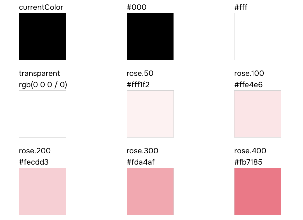
### `semantic-tokens.json`
#### Structure
This file contains an array of semantic token definitions grouped by category, with conditional values for different
modes (e.g., light/dark).
```json
{
"type": "semantic-tokens",
"data": [
{
"type": "colors",
"values": [
{
"name": "bg",
"values": [
{ "value": "{colors.white}", "condition": "base" },
{ "value": "{colors.dark}", "condition": "dark" }
],
"cssVar": "var(--colors-bg)"
}
],
"tokenFunctionExamples": ["token('colors.bg')", "token.var('colors.bg')"],
"functionExamples": ["css({ color: 'bg' })"],
"jsxExamples": ["{color.name}
{color.value}
{colors?.values.map(token => (
))}
)
}
```
### `recipes.json`
#### Structure
This file contains an array of recipe definitions for styling components with variant support.
```json
{
"type": "recipes",
"data": [
{
"name": "button",
"description": "A button style",
"variants": {
"shape": ["square", "circle"],
"color": ["main", "black", "white"],
"size": ["sm", "md", "lg"]
},
"defaultVariants": {
"shape": "square",
"color": "main",
"size": "md"
},
"functionExamples": ["button({ shape: 'square' })", "button({ color: 'main' })", "button({ size: 'sm' })"],
"jsxExamples": ["", "", ""]
}
]
}
```
Each recipe in the `data` array includes:
- **name**: the recipe name (e.g., `button`, `card`)
- **description**: optional description of what the recipe does
- **variants**: an object where each key is a variant name and each value is an array of allowed options
- **defaultVariants**: an object defining the default option for each variant
- **functionExamples**: examples of how to use the recipe function
- **jsxExamples**: examples of how to use the recipe in JSX
#### Usage
Here's an example of how to document a button recipe within a table:
```tsx
import recipes from 'styled-system/specs/recipes.json'
const Demo = () => {
const buttonRecipe = recipes.data.find(recipe => recipe.name === 'button')
const defaultVariants = buttonRecipe?.defaultVariants || {}
return (
{token.name}
{token.cssVar}
{token.values.map(({ condition, value }) => (
{condition}
))}
{value}
{buttonRecipe?.name}
{buttonRecipe?.description &&{buttonRecipe.description}
}| Variant | Options | Default |
|---|---|---|
| {key} | {(options as string[]).map(option => ( {option} ))} | {defaultVariants[key as keyof typeof defaultVariants] || 'none'} |
{textStyles.data.map(style => (
)
}
```
### `layer-styles.json`
#### Structure
This file contains an array of layer style definitions for visual presets (backgrounds, shadows, borders, etc.).
```json
{
"type": "layer-styles",
"data": [
{
"name": "offShadow",
"functionExamples": ["css({ layerStyle: 'offShadow' })"],
"jsxExamples": ["
{style.name}
))}
The quick brown fox jumps over the lazy dog
{layerStyles.data.map(style => (
)
}
```
### `animation-styles.json`
Contains an array of animation style entries. Each entry includes:
- `name` — the animation preset name
- Animation properties such as `duration`, `timingFunction`, etc.
- Optional examples: `functionExamples` and `jsxExamples`
If no animation styles are configured in your `panda.config.ts` file , this file will contain an empty data array.
### `keyframes.json`
#### Structure
This file contains an array of keyframe definitions for CSS animations.
```json
{
"type": "keyframes",
"data": [
{
"name": "spin",
"functionExamples": ["css({ animationName: 'spin' })", "css({ animation: 'spin 1s ease-in-out infinite' })"],
"jsxExamples": ["
{style.name}
))}
{keyframes.data.map(keyframe => (
)
}
```
### `patterns.json`
#### Structure
This file contains an array of pattern definitions for layout utilities.
```json
{
"type": "patterns",
"data": [
{
"name": "flex",
"jsx": "Flex",
"properties": [
{ "name": "align", "type": "SystemProperties['alignItems']" },
{ "name": "justify", "type": "SystemProperties['justifyContent']" },
{ "name": "direction", "type": "SystemProperties['flexDirection']" },
{ "name": "wrap", "type": "SystemProperties['flexWrap']" }
],
"functionExamples": ["flex({ align: 'center' })", "flex({ justify: 'space-between' })"],
"jsxExamples": ["
{keyframe.name}
))}
{patterns.data.map(pattern => (
)}
))}
)
}
```
### `conditions.json`
Contains an array of condition entries. Each entry includes:
- `name` — the condition key used in style objects (e.g.,`_hover`, `_focus`, `_focusWithin`)
- `value` — the CSS selector or media query that the condition maps to
- Optional examples: `functionExamples` and `jsxExamples`
## FAQs
### Can I edit the spec files directly?
**No.** The spec files are **generated** files—you should **not** edit your design tokens, recipes, or theme directly in
these files. All configuration changes must be made in your `panda.config.ts` file. The spec files exist purely for
documentation and visualization purposes.
---
## Using Panda Studio
Document your design system visually using Panda Studio.
{pattern.name}
{'<'} {pattern.jsx} {'/'} {'>'} {pattern.properties.length > 0 && (| Prop | Type | Default |
|---|---|---|
| {prop.name} | {prop.type} | {prop.defaultValue || '—'} |
setTokens(getTokenJson({ category: 'colors', query: e.target.value }))} />
)
}
```
The generated module is self-contained — the runtime is inlined with your tokens baked in, so it imports nothing at
runtime.
## See also
- [Panda Studio](/docs/theming/studio) for the current, shipped version.
- [Upgrading to v2](/docs/styling/upgrading-to-v2) for the broader rewrite this belongs to.
---
## Text Styles
Define reusable typography css properties.
Text styles allows you to define textual css properties. The common properties are:
- The font family, weight, size
- Line height
- Letter spacing
- Text Decoration (strikethrough and underline)
- Text Transform (uppercase, lowercase, and capitalization)
## Defining text styles
Text styles are defined in the `textStyles` property of the theme.
Here's an example of a text style:
```js filename="text-styles.ts"
import { defineTextStyles } from '@pandacss/dev'
export const textStyles = defineTextStyles({
body: {
description: 'The body text style - used in paragraphs',
value: {
fontFamily: 'Inter',
fontWeight: '500',
fontSize: '16px',
lineHeight: '24px',
letterSpacing: '0',
textDecoration: 'None',
textTransform: 'None'
}
}
})
```
> **Good to know:** The `value` property maps to style objects that will be applied to the text.
## Update the config
To use the text styles, we need to update the `config` object in the `panda.config.ts` file.
```js filename="panda.config.ts"
import { defineConfig } from '@pandacss/dev'
import { textStyles } from './text-styles'
export default defineConfig({
theme: {
extend: {
textStyles
}
}
})
```
This should automatically update the generated theme the specified `textStyles`. If this doesn't happen, you can run the
`panda codegen` command.
## Using text styles
Now we can use `textStyle` property in our components.
```jsx
import { css } from '../styled-system/css'
function App() {
return This is a paragraph from Panda with the body text style.
} ``` ## Nesting text styles Text styles support nested structures with a special `DEFAULT` key. This allows you to create variants of a text style while having a default fallback. When you define a `DEFAULT` key within a nested text style, you can reference the parent key directly to use the default value. ```js filename="panda.config.ts" export default defineConfig({ theme: { extend: { textStyles: { heading: { DEFAULT: { value: { fontFamily: 'Inter', fontWeight: 'bold', fontSize: '1.5rem', lineHeight: '1.2' } }, h1: { value: { fontFamily: 'Inter', fontWeight: 'bold', fontSize: '2.5rem', lineHeight: '1.1' } }, h2: { value: { fontFamily: 'Inter', fontWeight: 'bold', fontSize: '2rem', lineHeight: '1.15' } } } } } } }) ``` Now you can use the default heading style or specific variants: ```jsx import { css } from '../styled-system/css' function App() { return (Main Title
Subtitle
Uses DEFAULT variant
Hello World
) } ``` You can also add an optional description to your tokens. This will be used in the autogenerate token documentation. ```js {8} import { defineConfig } from '@pandacss/dev' export default defineConfig({ theme: { tokens: { colors: { danger: { value: '#EE0F0F', description: 'Color for errors' } } } } }) ``` ## Semantic Tokens Semantic tokens are tokens that are designed to be used in a specific context. In most cases, the value of a semantic token references to an existing token. > To reference a value in a semantic token, use the `{}` syntax. For example, assuming we've defined the following tokens: - `red` and `green` are raw tokens that define the color red and green. - `danger` and `success` are semantic tokens that reference the `red` and `green` tokens. ```js import { defineConfig } from '@pandacss/dev' export default defineConfig({ theme: { tokens: { colors: { red: { value: '#EE0F0F' }, green: { value: '#0FEE0F' } } }, semanticTokens: { colors: { danger: { value: '{colors.red}' }, success: { value: '{colors.green}' } } } } }) ``` > ⚠️ Semantic Token values need to be nested in an object with a `value` key. This is to allow for additional properties > like `description` and more in the future. Semantic tokens can also be changed based on the [conditions](/docs/styling/conditional-styles) like light and dark modes. For example, if you want a color to change automatically based on light or dark mode. ```js import { defineConfig } from '@pandacss/dev' export default defineConfig({ // ... theme: { semanticTokens: { colors: { danger: { value: { base: '{colors.red}', _dark: '{colors.darkred}' } }, success: { value: { base: '{colors.green}', _dark: '{colors.darkgreen}' } } } } } }) ``` > NOTE 🚨: The conditions used in semantic tokens must be an at-rule or parent selector > [condition](/docs/styling/conditional-styles#reference). ## Token Nesting Tokens can be nested to create a hierarchy of tokens. This is useful when you want to group tokens together. > Tip: You can use the `DEFAULT` key to define the default value of a nested token. ```js import { defineConfig } from '@pandacss/dev' export default defineConfig({ // ... theme: { semanticTokens: { colors: { bg: { DEFAULT: { value: '{colors.gray.100}' }, muted: { value: '{colors.gray.100}' } } } } } }) ``` This allows the use of the `bg` token in the following ways: ```jsx import { css } from '../styled-system/css' function App() { return (
Hello World
)
}
```
## Token Types
Panda supports the following token types:
### Colors
Colors have meaning and support the purpose of the content, communicating things like hierarchy of information, and
states. It is mostly defined as a string value or reference to other tokens.
```jsx
const theme = {
tokens: {
colors: {
red: { 100: { value: '#fff1f0' } }
}
}
}
```
### Gradients
Gradient tokens represent a smooth transition between two or more colors. Its value can be defined as a string or a
composite value.
```ts
type Gradient =
| string
| {
type: 'linear' | 'radial'
placement: string | number
stops:
| Array<{
color: string
position: number
}>
| ArrayText
` work as expected. ## Re-using Panda presets Panda offers 2 presets: - `@pandacss/preset-base`: This is a relatively unopinionated set of utilities for mapping CSS properties to values (almost everyone will want these) You can use these presets by installing them via npm and adding them to your `presets` key: ```js export default defineConfig({ // ... presets: ['@pandacss/preset-base'] }) ``` - `@pandacss/preset-panda` as an opinionated set of tokens if you don't want to define your own colors/spacing/fonts etc. ```js export default defineConfig({ // ... presets: ['@pandacss/preset-panda'] }) ``` > Note: Panda doesn't add `@pandacss/preset-base` or `@pandacss/preset-panda` for you. Install the ones you want and list > them in `presets`. --- ## Monorepo dev workflow Running Panda's watch mode across a shared package and the apps that consume it, and what to check when changes don't show up. Once you have a [shared styled-system package](/docs/design-systems/shared-styled-system), local development usually means running Panda's watch mode in more than one workspace package at once. This page covers what that setup looks like and the most common way it goes wrong: a change that shows up in the DOM but not in the generated CSS until you restart. ## Watching across a workspace boundary An app's `include` glob can point at a sibling package's source through the workspace symlink in `node_modules`, and Panda's watcher follows it like any other included path: ```tsx filename="apps/marketing/panda.config.ts" import { defineConfig } from '@pandacss/dev' export default defineConfig({ //... include: [ './node_modules/@acme/design-system/src/**/*.{ts,tsx}', './src/**/*.{ts,tsx}' ] }) ``` Run the app's own watch command and it picks up changes in both places: ```bash panda --watch ``` If the shared package also needs its own local dev loop, for example you're iterating on it in isolation before an app picks up the change, give it the same script. Most monorepo component-library setups run `panda --watch` in each package that has its own `panda.config.ts`, not just the consuming app. ## When changes don't show up without a restart If you save a change in the shared package and the page updates but the styling doesn't, or doesn't update at all until you restart the dev server, check these in order: 1. **Confirm Panda actually saw the change.** Run with `PANDA_DEBUG=file:*` and save the file again. If nothing prints, Panda's watcher didn't detect it, this is a filesystem event problem, not a bundler one. 2. **Try polling.** Native filesystem events don't always fire reliably across workspace symlinks, network drives, Docker volumes, or WSL. Panda's watch mode has a `--poll` flag for exactly this: ```bash panda --watch --poll ``` Polling is slower than native events, so only reach for it once step 1 shows Panda isn't seeing changes with the default watcher. 3. **Confirm your bundler's own dev server is watching the shared package too.** If step 1 shows Panda regenerated the CSS correctly but the browser still shows the old styles, the app's dev server (Vite, webpack, whichever you're using) may not be watching that path itself, some dev servers exclude `node_modules` (including workspace symlinks) from their own file watcher by default, separately from whatever Panda is doing. This is a bundler configuration question, and the exact fix depends on which one you're using, but the symptom is the same: Panda's output on disk is correct, the running dev server just hasn't reloaded it. ## Build order If the shared package needs to be built (not just watched) before an app can resolve its types, for example a TypeScript project reference or a package that ships compiled `.d.ts` files rather than resolving `panda.config.ts` output directly, start the shared package's watch process before the app's. Otherwise the app's first type-check can fail against output that doesn't exist yet. ## See also - [Shared styled-system in a monorepo](/docs/design-systems/shared-styled-system) for setting up the package this workflow assumes already exists. - [Debugging](/docs/reference/debugging) for `PANDA_DEBUG` and `panda debug` in more depth. --- ## Using Panda in a Component Library How to build and ship a component library on Panda, from setup through packaging and troubleshooting. A component library ships finished, styled components: a `